The article outlines the functionalities of the new Analytics experience, which we're continuously improving. If you have any feedback about the new Analytics experience, we'd love to hear them from you.
If you want to view analytics for the Training feature, learn more about the performance dashboard.
What is Analytics in SafetyCulture?
Analytics in SafetyCulture allows you to visualize and understand the data your team captures. It’s best used when you need clear visibility into KPIs, performance trends, or specific areas that need attention. Analytics works through customizable dashboards, where you can choose from different chart types, tailor how your data is displayed, and control access using dedicated permissions.
For example, you can track inspection scores across sites, monitor action completion rates, or review data created across a period of time. You can also share dashboards within your team or export data for reporting, helping teams surface insights, highlight improvement opportunities, and make data-driven decisions.
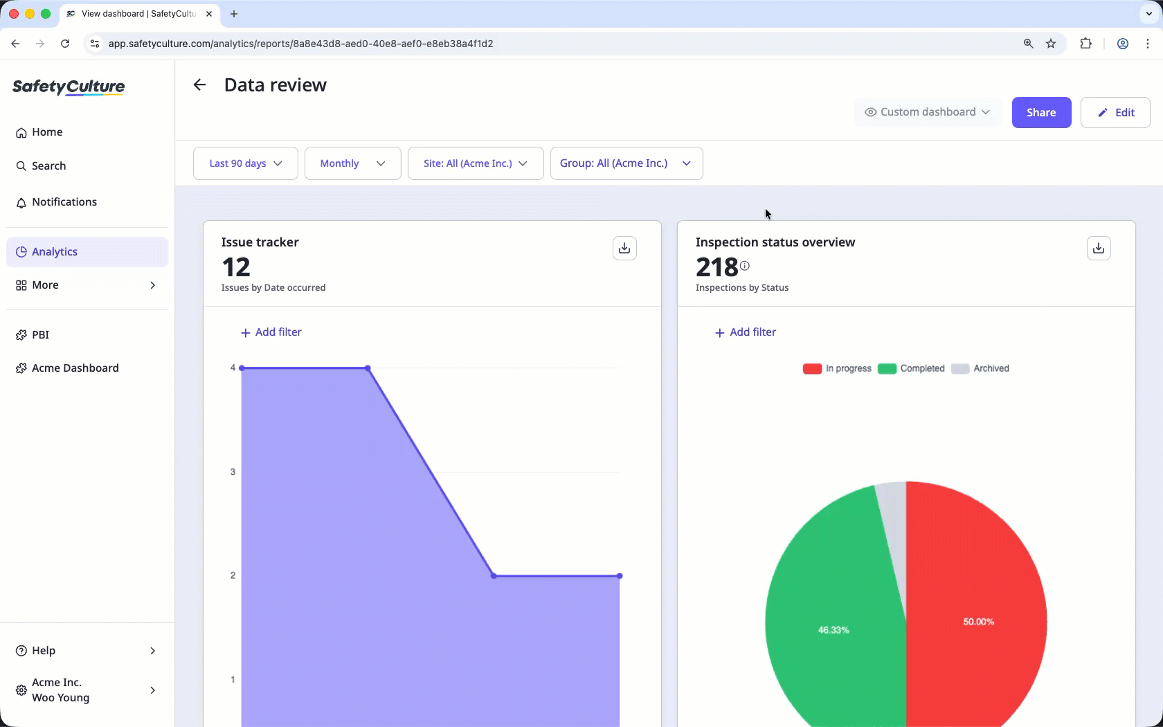
Exploring Analytics in SafetyCulture
Dashboard creation and sharing
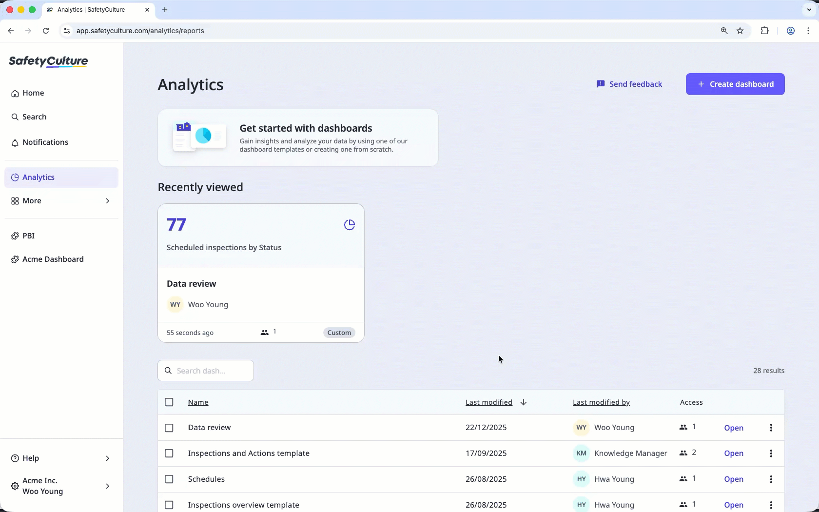
Analytics features a homepage where you can view all dashboards you have access to and create new dashboards based on your needs. This allows you to set up different dashboard types without reconfiguring charts and filters each time you visit Analytics or want to interpret different data sets. You can also duplicate dashboards to share the same insights with different team members without rebuilding your setup.
To help you get started with your dashboard, you can select one that suits your needs from our recommended templates with pre-selected data sets or start one from scratch.
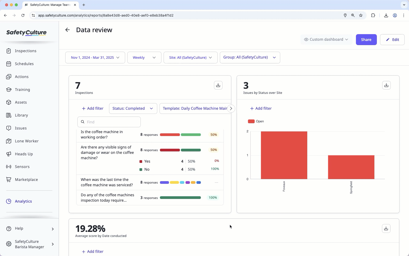
Precise data filtering
Focus on the insights that matter most by using powerful dashboard and chart filters to refine your view. With dashboard filters, you can quickly streamline your entire page by criteria such as date range, frequency, site, or group, ensuring your data is always relevant to your reporting needs. For a more granular analysis, you can also apply chart filters to drill down into specific data points and fine-tune your selection with precision. By narrowing your focus at both the dashboard and chart levels, you can cut through the noise and surface the exact information you need to drive improvements across your organization.
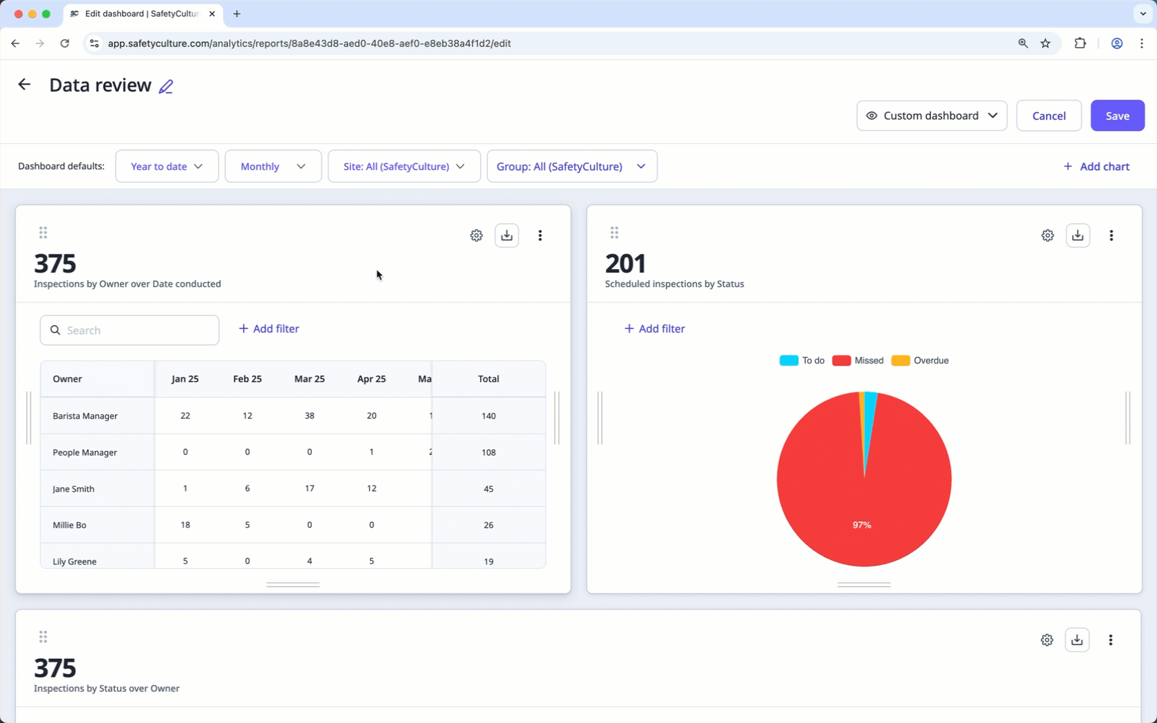
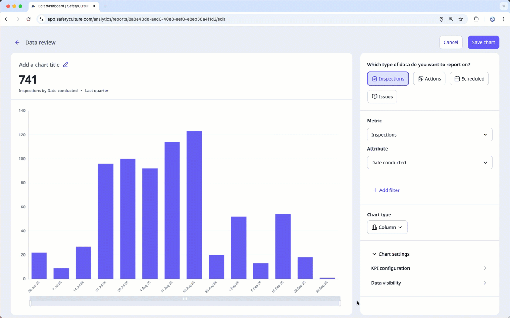
Customizable charts
Visualize your performance exactly how you want with flexible chart customization. By combining specific metrics and attributes, you can tailor your charts to suit your data type and turn raw insights into meaningful action. Select the chart type that best tells your story and configure KPIs to monitor progress against your targets in real time.
For example, you can track the number of inspections conducted over time to ensure your teams are consistently meeting the goals you’ve set and stay on track for success.
Dashboard sharing
Once you’ve configured your Analytics dashboard to suit your specific use case, you can selectively share it with groups or your entire organization. Sharing your dashboards empowers your teams with the data they need to stay aligned and make informed decisions that drive safety and quality performance. Whether you’re providing a high-level overview for leadership or generating a shareable link for specific team members, managing access ensures that the right insights reach the right people at the right time.
Data exporting
You can export data from Analytics in several ways. Download charts as images or CSV files, or export data types such as inspections, actions, issues, Heads Ups, and schedules in bulk for more detailed analysis.
You can also export your entire Analytics dashboard as a snapshot of all your charts, so your team can share reports or review trends outside the platform.