- Using SafetyCulture
- Analytics
- Analytics chart customization options
Analytics chart customization options
Learn about the different chart customization options in Analytics to improve visibility and identify patterns at a glance.What are Analytics charts?
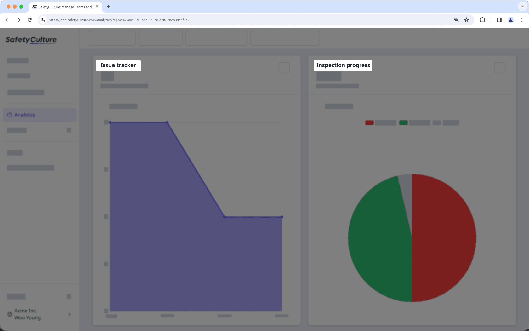
Analytics charts are visual tools that help you understand your data at a glance, simplifying complex information and highlighting trends that are oftentimes hard to spot.
For example, you can compare inspection results and completion rate across sites during peak seasons. Using charts in your Analytics dashboards, you customize the data you see by changing chart types, configuring attributes, and modifying filters. This helps you monitor performance, identity patterns, and act on insights faster.
We're constantly working to expand and enhance chart customization options for you. If you have any feedback or suggestions, we'd love to hear them from you!
Chart customization options
This option allows you to select metrics and attributes based on your chart configuration and the type of data you want to report on, whether it's for inspections, actions, or issues.
This option lets you add chart titles so you can easily identify the data that your charts represent.

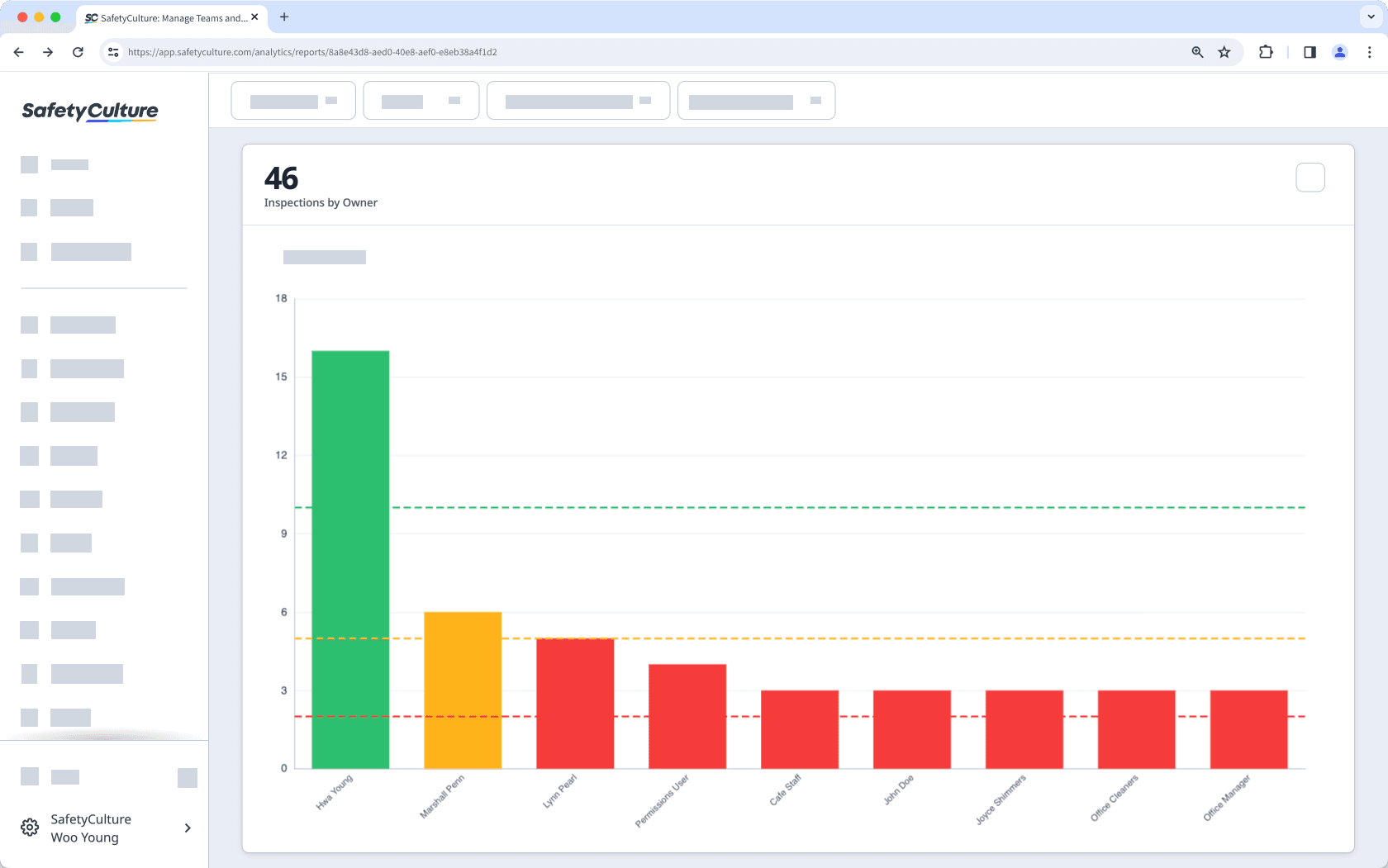
This option allows you to select a chart type that visually represents your data. Based on your needs, you can choose a bar, pie, line, table, dial, or dual-axis chart.
This option allows you to add a key performance indicator (KPI) and a target value to show whether your organization has reached a particular goal.

This option lets you control which data to show or hide in your charts, reducing noise and ensuring that they only show relevant details.
This option lets you resize your charts to appear smaller or larger on your dashboards so you can better see which data is most relevant to your organization.
Selecting metrics under different data types is not currently supported for dual-axis charts. For example, only metrics under the Inspections data set can be used in a dual-axis chart.
Frequently asked questions
No, it's currently not possible to customize and select different colors for your charts.
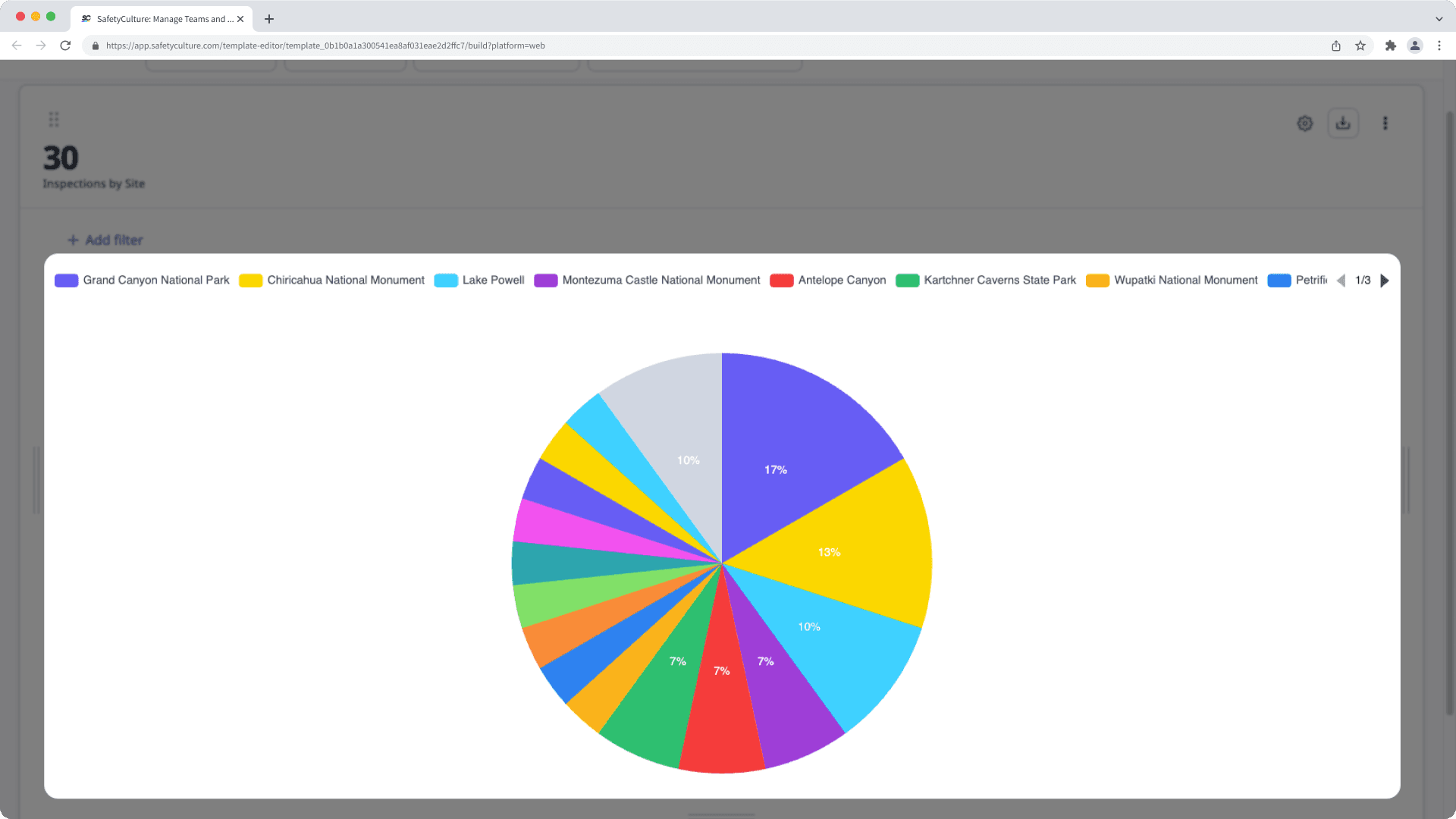
Charts use a set of 12 default colors, applied in order from the metric with the most data to the least. The color order is: SafetyCulture purple, yellow, light blue, purple, red, green, light orange, blue, orange, light green, turquoise, and pink. Only the first 15 data points are displayed individually, and any remaining data is grouped together and shown in gray.

Was this page helpful?
Thank you for letting us know.