What is the performance dashboard?
The performance dashboard offers an in-depth view of your organization's progression and engagement for the Training feature. From an overview of course completion rate and performance to a drill-down of performance (score and completion) at the course, group, and user levels, you can gather insights on what training strategy is working and refine your content over time to improve your team's learning continuously.
Performance dashboard gives you an in-depth view of training performance in your organization. If you want a simple view of your team member's individual course progress, consider using the training matrix or course completion by users.
Exploring the performance dashboard in SafetyCulture
View your data
The performance dashboard gives you a clear view of your organization’s training activity and outcomes. It’s organized into different tabs, each designed to help you analyze performance from a specific perspective, whether you’re looking at overall trends, course engagement, or individual progress.
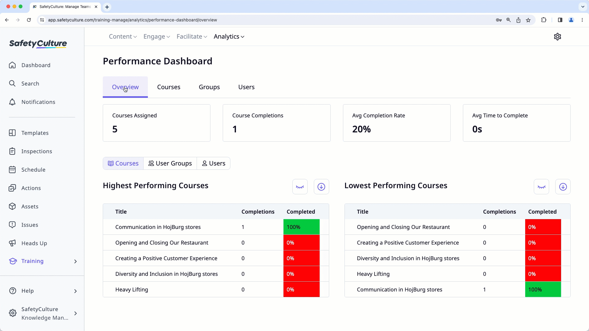
Overview
The "Overview" tab provides a summary of your organization’s key training metrics at a glance. It shows data such as the total number of courses assigned, course completions, average completion rate, and average time to complete courses.
Below these metrics, you can view insights into course performance, including the highest and lowest performing courses, user groups, or users based on completion data. This helps you quickly identify which training programs are most effective and which may need improvement.
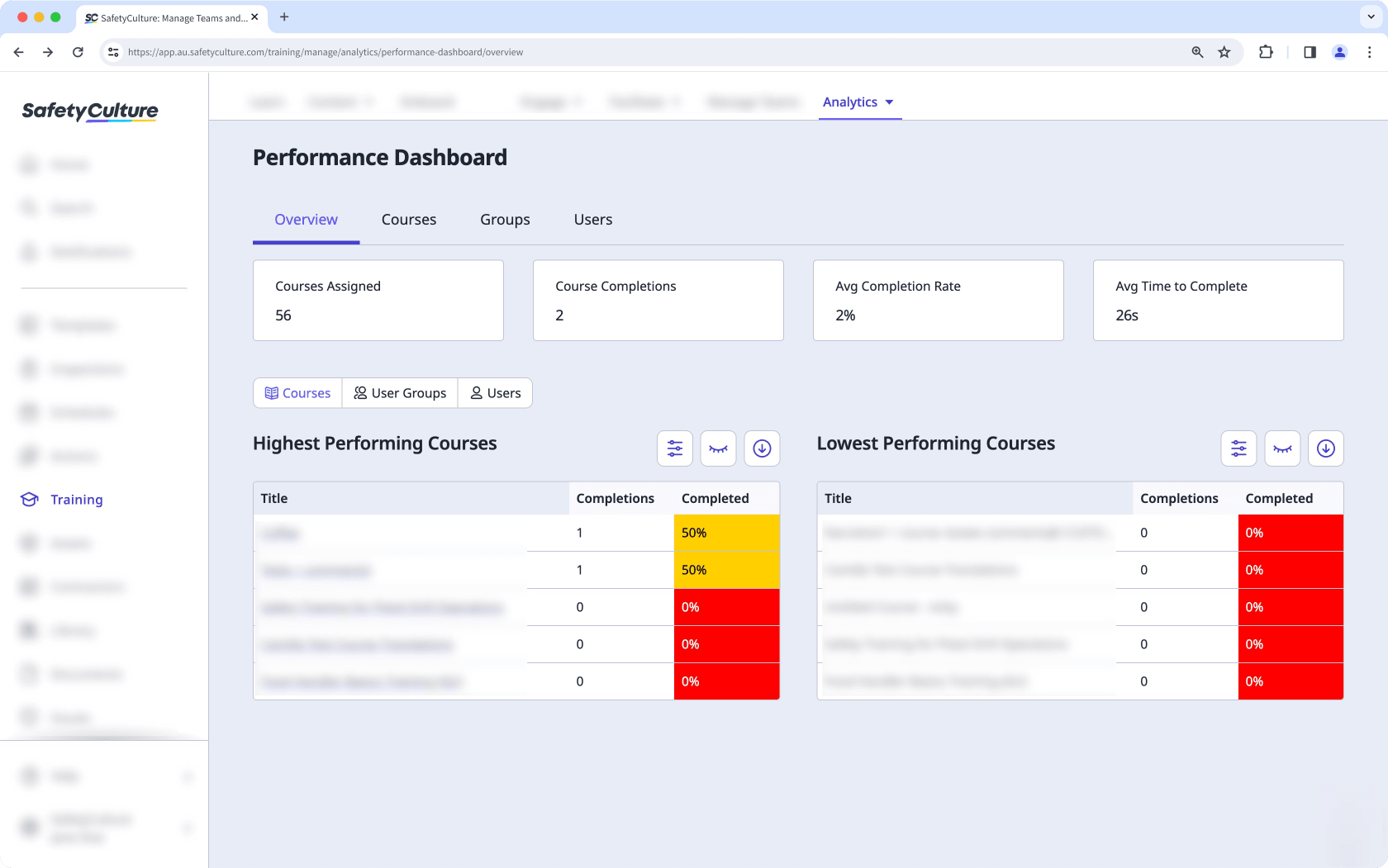
Courses
The "Courses" tab outlines the metrics for all published courses in your organization. Similar to the drill-down options in the "Overview" tab, you can view each course in-depth and gather insights, including:
Which courses are users spending the most time on?
How many attempts did each user take for a course?
Which lessons are getting the most incorrect answers?
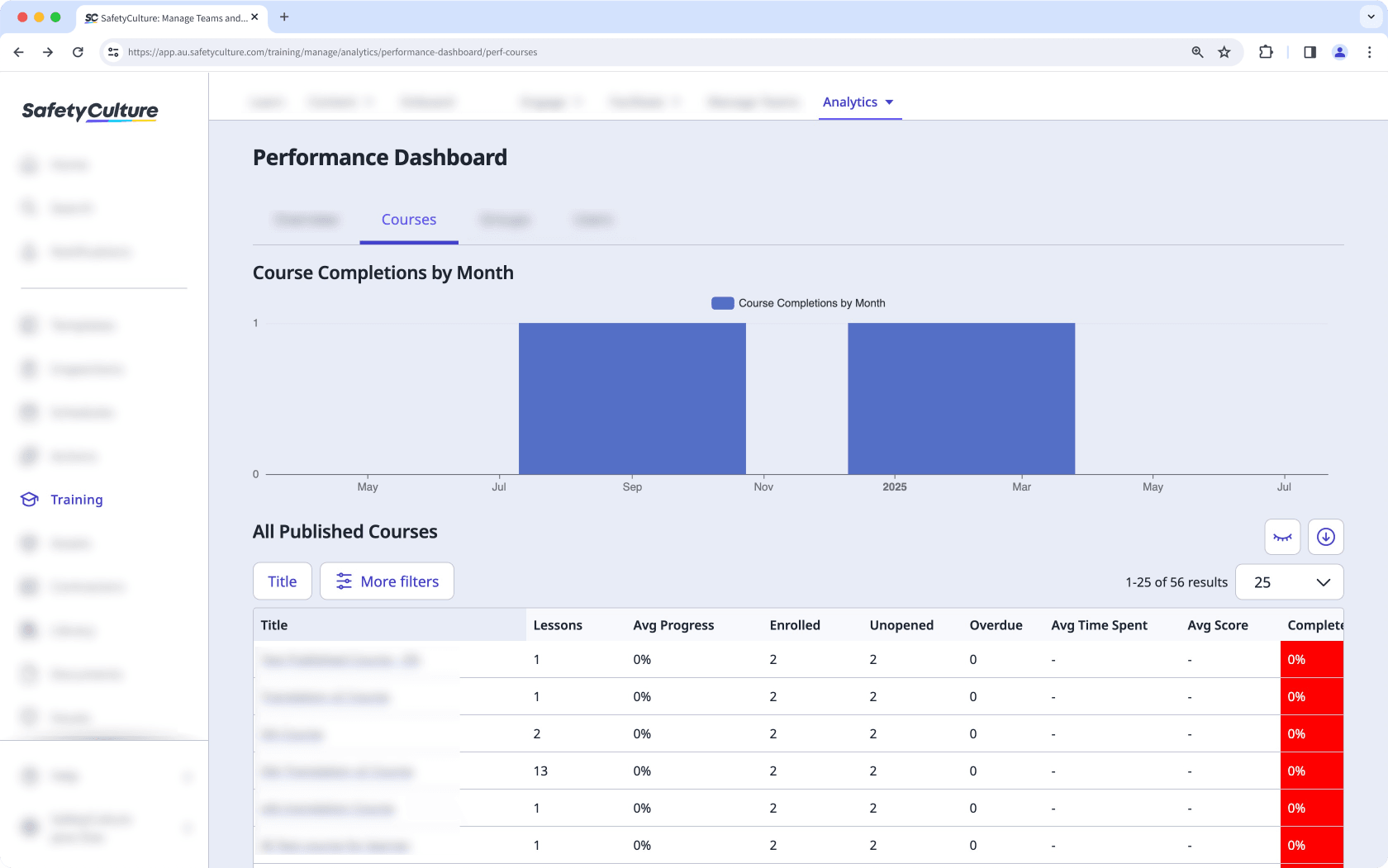
Groups and Users
The "Groups" and "Users" tabs allow you to view training performance for groups (and sites) and users in your organization. If you need to look into the progress for specific groups and users, you can drill down and find out which courses a group has completed, as well as how each user is progressing with their training.
Filter data by relevance
You can filter data in the performance dashboard to view the information that matters most to you. Each tab includes its own set of filters, allowing you to refine results and focus on specific courses, groups, users, or time periods.
Customize how you want to view your training data using the following options:
Clickto narrow down your results.
Clickto show and hide columns in tables.
Clickto export the data as CSV.
Overview
In the "Overview" tab, you can filter by course type to display either mandatory or optional courses. This helps you compare completion trends and engagement across different types of training.
Courses
The "Courses" tab includes several filters that let you analyze course performance in detail to track training engagement and identify which courses are performing well or may need updates. You can filter by:
Mandatory status (mandatory or optional)
Date published
Average progress
Enrolled users
Unopened courses
Average time spent
Average score
Completed percentage
Groups
In the "Groups" tab, you can organize and refine data by Group/Site or Parent group. These options help you evaluate performance across different teams or locations. Additional filters include:
Mandatory status
Number of courses
Users
Inactive users
Average score
Average progress
Average time spent
Completion rate
Users
In the "Users" tab, you can use the User Activity filter to view users who are recently active or inactive. This makes it easy to identify training engagement and pinpoint users who may need additional support. You can also filter by:
Mandatory status
User name or full name
Courses assigned
Average progress
Average score
Overdue courses
Visits in the last 30 days
Completions
Completed percentage