Créer des graphiques et des tableaux de bord dans la nouvelle version de Données analytiques
Découvrez comment créer des graphiques et des tableaux de bord similaires à ceux de la version héritage dans la nouvelle version de Données analytiques.En quoi consiste la nouvelle expérience Données analytiques ?
La nouvelle expérience Données analytiques améliore la flexibilité de la création de tableaux de bord qui se concentrent sur des zones d'intérêt et affiche les données dans chaque tableau de bord.
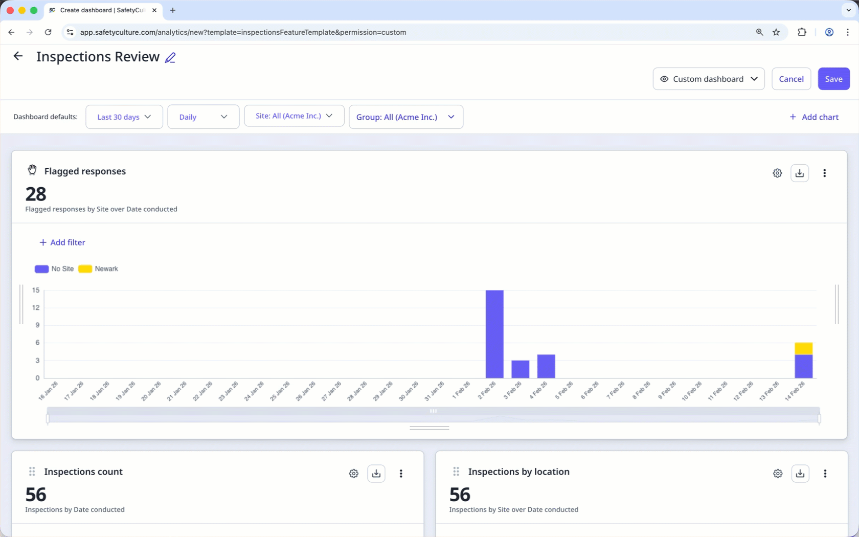
Conçu pour être plus flexible, vous pouvez désormais créer des tableaux de bord pour des ensembles de données spécifiques qui vous concernent, avec différents types de graphiques afin de mieux comprendre les données affichées et d'identifier facilement les tendances grâce aux nombreuses options de personnalisatio. IDe plus, vous pouvez partager facilement les tableaux de bord pertinents avec vos utilisateurs. En fonction du type de tableau de bord et des autorisations définies, ils pourront l'afficher ou le gérer selon leurs besoins.
Si votre organisation a encore accès à la version héritage de Données analytiques, vous pouvez créer un tableau de bord à l'aide du modèle de tableau de bord « De la version héritage à la nouvelle version ».
Créer des graphiques et des tableaux de bord dans le nouveau logiciel Données analytiques
Select
Données analytiques from the menu on the left-hand side.
Click
Modifier on the upper-right of the page.
Click
Ajouter un graphique on the upper-right of the page, and select
Ajouter un graphique personnalisé.
In the chart builder, configure the chart as follows:
Data type: Select
Inspections from the upper-right of the page.
Metric: Select Inspections from the dropdown.
Attribute: Select Date effectuée from the dropdown.
Chart type: Select
Graphique linéaire from the dropdown.
Click Enregistrer le graphique on the upper-right of the page to save the changes to the chart.
Click Enregistrer on the upper-right of the page to save the changes to your dashboard.
Select
Données analytiques from the menu on the left-hand side.
Click
Modifier on the upper-right of the page.
Click
Ajouter un graphique on the upper-right of the page, and select
Ajouter un graphique personnalisé.
In the chart builder, configure the chart as follows:
Data type: Select
Inspections from the upper-right of the page.
Metric: Select Score moyen from the dropdown.
Attribute: Select Date effectuée from the dropdown.
Chart type: Select
Graphique linéaire from the dropdown.
Click Enregistrer le graphique on the upper-right of the page to save the changes to the chart.
Click Enregistrer on the upper-right of the page to save the changes to your dashboard.
Select
Données analytiques from the menu on the left-hand side.
Click
Modifier on the upper-right of the page.
Click
Ajouter un graphique on the upper-right of the page, and select
Ajouter un graphique personnalisé.
In the chart builder, configure the chart as follows:
Data type: Select
Inspections from the upper-right of the page.
Metric: Select Réponses from the dropdown.
Response set: Click Sélectionner le jeu de réponses and select the default response set or Global Response Set you want to use.
Chart type: Select
Colonne from the dropdown.
Click Enregistrer le graphique on the upper-right of the page to save the changes to the chart.
Click Enregistrer on the upper-right of the page to save the changes to your dashboard.
Select
Données analytiques from the menu on the left-hand side.
Click
Modifier on the upper-right of the page.
Click
Ajouter un graphique on the upper-right of the page, and select
Ajouter un graphique personnalisé.
In the chart builder, configure the chart as follows:
Data type: Select
Inspections from the upper-right of the page.
Metric: Select Réponses signalées from the dropdown.
Attribute: Select Question from the dropdown.
Chart type: Select
Tableau from the dropdown.
Click Enregistrer le graphique on the upper-right of the page to save the changes to the chart.
Click Enregistrer on the upper-right of the page to save the changes to your dashboard.
Select
Données analytiques from the menu on the left-hand side.
Click
Modifier on the upper-right of the page.
Click
Ajouter un graphique on the upper-right of the page, and select
Ajouter un graphique personnalisé.
In the chart builder, configure the chart as follows:
Data type: Select
Inspections from the upper-right of the page.
Metric: Select Inspections from the dropdown.
Attribute: Select Propriétaire from the dropdown.
Chart type: Select
Tableau de la chronologie from the dropdown.
Click Enregistrer le graphique on the upper-right of the page to save the changes to the chart.
Click Enregistrer on the upper-right of the page to save the changes to your dashboard.
Select
Données analytiques from the menu on the left-hand side.
Click
Modifier on the upper-right of the page.
Click
Ajouter un graphique on the upper-right of the page, and select
Ajouter un graphique personnalisé.
In the chart builder, configure the chart as follows:
Data type: Select
Inspections from the upper-right of the page.
Metric: Select Score moyen from the dropdown.
Attribute: Select Propriétaire from the dropdown.
Chart type: Select
Tableau de la chronologie from the dropdown.
Click Enregistrer le graphique on the upper-right of the page to save the changes to the chart.
Click Enregistrer on the upper-right of the page to save the changes to your dashboard.
Select
Données analytiques from the menu on the left-hand side.
Click
Modifier on the upper-right of the page.
Click
Ajouter un graphique on the upper-right of the page, and select
Ajouter un graphique personnalisé.
In the chart builder, configure the chart as follows:
Data type: Select
Planifiées from the upper-right of the page.
Metric: Select Inspections planifiées from the dropdown.
Attribute: Select Planning from the dropdown.
Chart type: Select
Tableau from the dropdown.
Click Enregistrer le graphique on the upper-right of the page to save the changes to the chart.
Click Enregistrer on the upper-right of the page to save the changes to your dashboard.
Select
Données analytiques from the menu on the left-hand side.
Click
Modifier on the upper-right of the page.
Click
Ajouter un graphique on the upper-right of the page, and select
Ajouter un graphique personnalisé.
In the chart builder, configure the chart as follows:
Data type: Select
Inspections from the upper-right of the page.
Metric: Select Réponses signalées from the dropdown.
Attribute: Select Date effectuée from the dropdown.
Chart type: Select
Graphique linéaire from the dropdown.
Click Enregistrer le graphique on the upper-right of the page to save the changes to the chart.
Click Enregistrer on the upper-right of the page to save the changes to your dashboard.
Select
Données analytiques from the menu on the left-hand side.
Click
Modifier on the upper-right of the page.
Click
Ajouter un graphique on the upper-right of the page, and select
Ajouter un graphique personnalisé.
In the chart builder, configure the chart as follows:
Data type: Select
Inspections from the upper-right of the page.
Metric: Select Inspections from the dropdown.
Chart type: Select
Onglet Réponses from the dropdown.
Template: Click Sélectionner un modèle and select the you want to view a response breakdown for.
Click Enregistrer le graphique on the upper-right of the page to save the changes to the chart.
Click Enregistrer on the upper-right of the page to save the changes to your dashboard.
Select
Données analytiques from the menu on the left-hand side.
Click
Modifier on the upper-right of the page.
Click
Ajouter un graphique on the upper-right of the page, and select
Ajouter un graphique personnalisé.
In the chart builder, configure the chart as follows:
Data type: Select
Inspections from the upper-right of the page.
Metric: Select Score moyen from the dropdown.
Attribute: Select Page / Section / Question from the dropdown.
Template: Click Sélectionner un modèle and select the template you want to track item scores for.
Chart type: Select
Tableau de la chronologie from the dropdown.
Click Enregistrer le graphique on the upper-right of the page to save the changes to the chart.
Click Enregistrer on the upper-right of the page to save the changes to your dashboard.
Nous vous recommandons de personnaliser vos graphiques et tableaux de bord pour tirer le meilleur parti de vos données.
FAQ
Pour que votre migration vers la nouvelle expérience soit aussi transparente que possible, nous travaillons sur les fonctionnalités suivantes :
Graphique du tableau de réponse
Filtre de questions et réponses
Téléchargements CSV groupés
Si vous avez d'autres idées pour améliorer la nouvelle expérience Données analytiques, n'hésitez pas à nous les communiquer.
Cette page vous a-t-elle été utile?
Merci pour votre commentaire.