Dashboard sharing
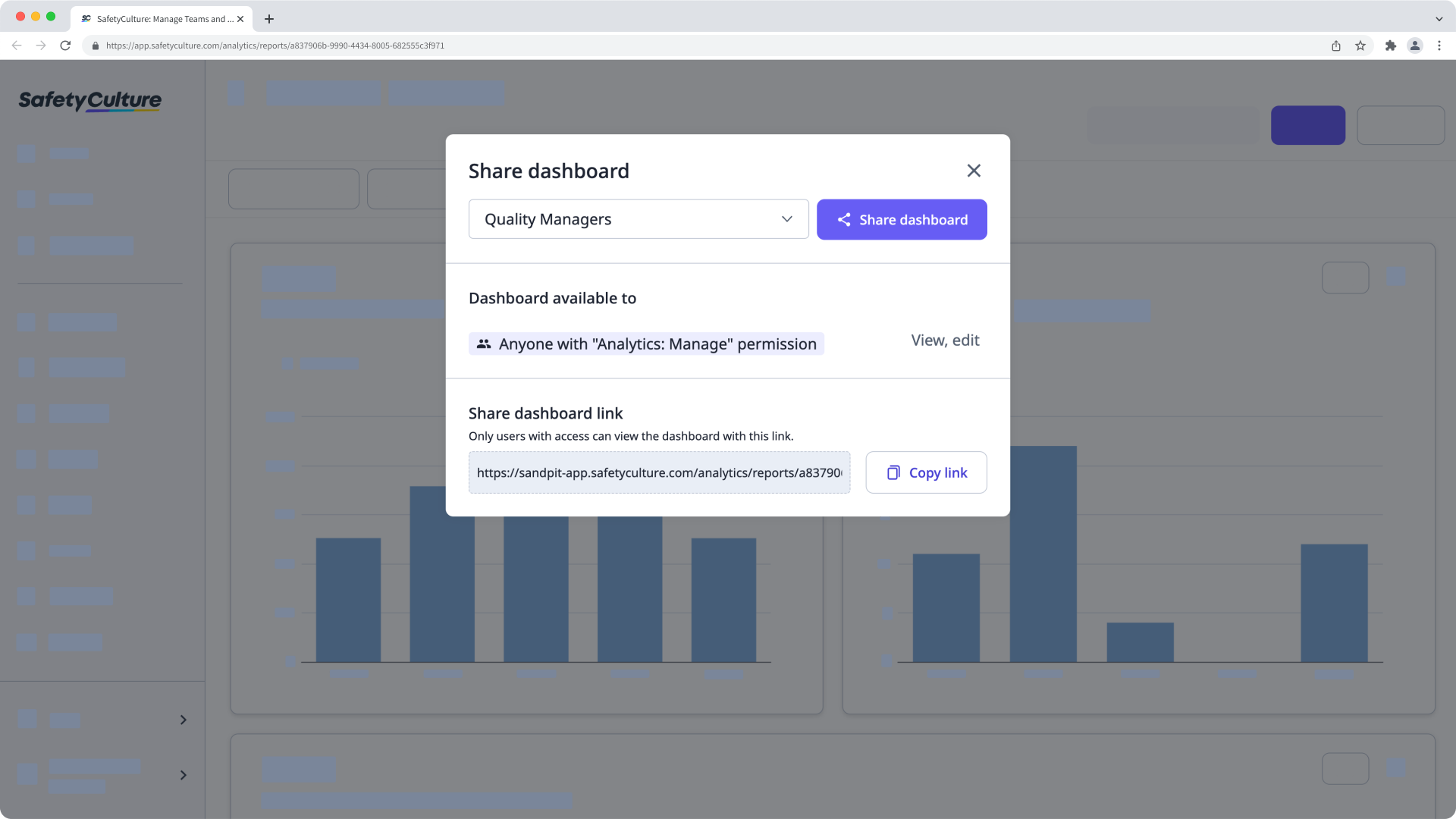
Once you've configured your analytics dashboard to suit your use case, you can selectively share it with groups or give everyone in your organization visibility. Simply click Share while viewing your dashboard and selecting the relevant groups.
What are Analytics dashboards?
Analytics dashboards allow you to create focused views of your organization's data within SafetyCulture. They keep data focused so teams and stakeholders only see what matters most to them.
By creating dashboards, you can manage the data flow across your organization so that sites or groups only see the information most relevant to them. For example, you can create a dashboard for site managers that highlights completion rates, and another for leadership that focuses on high-level trends. This helps reduce noise, protect sensitive information, and make faster, better-informed decisions.
Depending on the type of dashboard you want to create, you'll need the corresponding permission:
Custom dashboard: "Analytics: Manage" permission
Site-based dashboard: "Analytics: Create dashboard (site-based)" permission
Individual-based dashboard: "Analytics: Create dashboard (individual-based)" permission
What you'll need
Create an Analytics dashboard
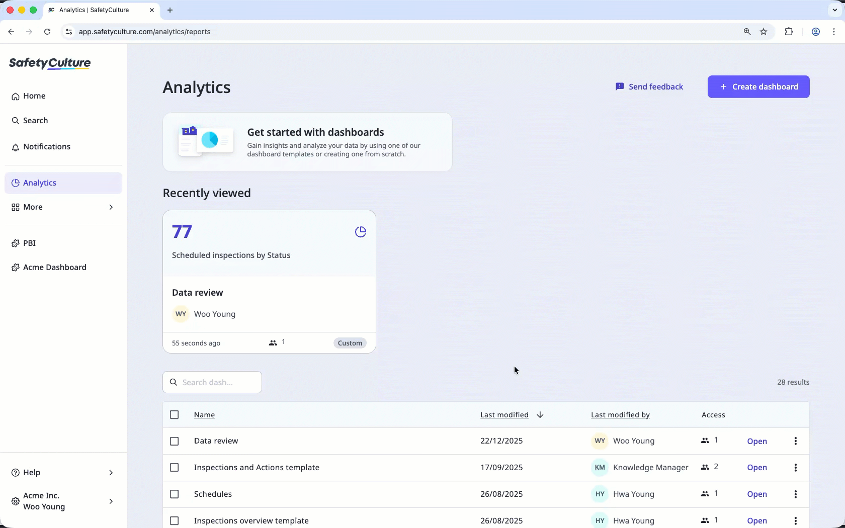
Select Analytics in the sidebar or select it in More.
Click Create dashboard on the upper-right of the page. Depending on your permission, select the type of dashboard you want to create in the pop-up window.
Select from the following options:
Use a dashboard template: Select this option if you'd like to make use of pre-made templates.
Start from scratch: Select this option if you'd like to create a dashboard from scratch based on data sets you want to analyze.
Click on the upper-left of the page to name your report.
Customize the charts in your report accordingly, ensuring that each chart is populated with data and any unwanted charts are deleted. You can also add, resize, and move charts as needed.
Click Save on the upper-right of the page.
Check out more in-depth content in the Analytics section.
← Previous article: Gather meaningful data (Part 1) | Next article: Gather meaningful data (Part 3) →