- Using SafetyCulture
- Analytics
- New Analytics experience
New Analytics experience
Learn the features and benefits of the new Analytics experience.Why are we introducing the new Analytics experience?
The new Analytics experience gives you full flexibility in creating dashboards that focus on areas of interest and visualize the data in each dashboard with various chart types, helping you make sense of the data you're viewing and identify trends.
To help you manage this at scale, we've also created dedicated permissions, allowing you to control who in your organization can view and create dashboards.
What's new
Analytics homepage
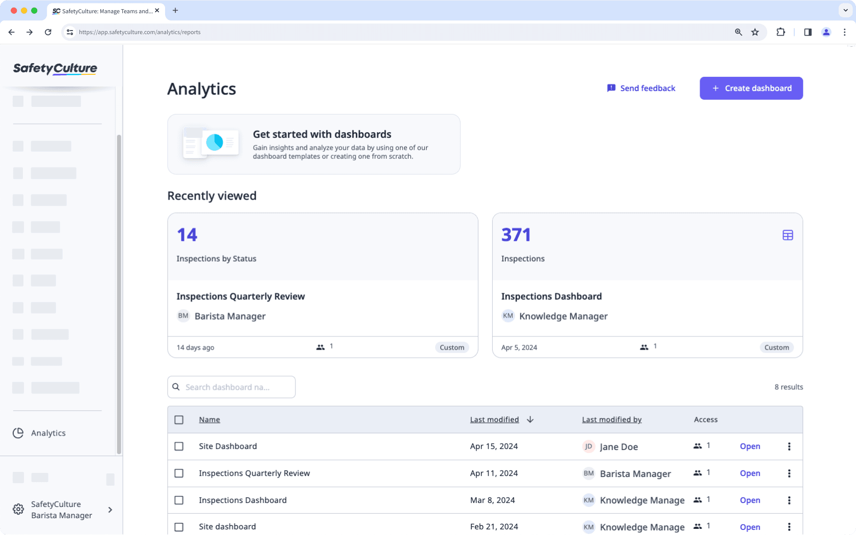
The new experience introduces a new homepage, listing individual Analytics dashboards you can see at a glance. On this page, you can easily create, duplicate, and delete dashboards.

Dashboard creation and sharing
You can create different types of dashboards, meaning you don't need to configure filters each time you visit Analytics or want to interpret different data sets. Once you've created a dashboard, you can easily view and share it with groups in your organization.
To help you get started with your dashboard, you can choose from recommended templates with pre-selected data sets or start one from scratch.
Customizable charts
Prefer a pie chart rather than a bar graph? Say no more. Now, you can change each chart's type to match the data you're analyzing based on what's relevant to you. With the new chart builder, you can customize your charts effortlessly using an intuitive interface, making reporting simpler and more efficient than ever before.
You can also add, delete, or move charts to further emphasize what's important for you and your team.
Improved filters and site selection menu
Accessing Analytics data is simple with customizable dashboard and chart filters. Set up dashboard filters like date, priority, site, and group to streamline your view.
Thanks to the new site selection dropdown menu, manual site selection is a thing of the past. Now, effortlessly filter data by specific areas, regions, states, and countries using the Sites feature. Depending on the dashboard you're creating, you can also automatically display data based on each user's site membership.
You can also easily fine-tune your data selection with chart filters by choosing the metrics and attributes that matter most.
Data exporting
You can export data from Analytics in a format that suits your needs. Download charts as images or CSV files for a quick overview, or export different data types such as inspections, actions, issues, and schedules in bulk for more detailed analysis. This is helpful for sharing insights, creating reports, or reviewing trends outside the platform.
Was this page helpful?
Thank you for letting us know.