Warum soll ich die Inspektionsleistung in Analysen anzeigen?
Die Inspektionsleistung zeichnet die Punktzahlen auf, die Nutzer für jede Inspektion erreicht haben. So können Sie Trends in Ihrer Organisation erkennen und Probleme beheben, die zu niedrigen Punktzahlen führen könnten.
Was Sie brauchen
Die Daten, die Sie in Diagramm-Aufschlüsselungen anzeigen und exportieren können, entsprechen denen, auf die Sie in SafetyCulture Zugriff haben. In diesem Artikel erfahren Sie, wie Sie sich selbst Zugriff auf die relevanten Daten gewähren oder sich selbst die Berechtigung „Übergeordnete Berechtigungen: Alle Daten anzeigen“ zuweisen können, um alle Daten in Ihrer Organisation anzuzeigen.
Wie funktionieren Bewertungen in Analysen?
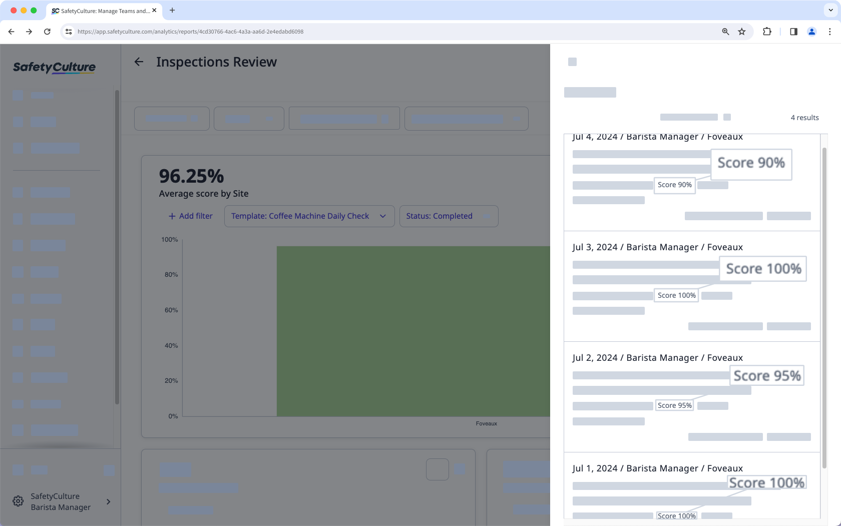
In den neuen Analysen wird die durchschnittliche Bewertung berechnet, indem alle prozentualen Bewertungen addiert und dann durch die Anzahl der Inspektionen geteilt werden.
Wenn Sie z. B. 4 Inspektionen mit Bewertungen von 90%, 100%, 95% und 100% haben, wird die durchschnittliche Bewertung wie folgt berechnet:
(90+100+95+100)/4 = 96,25%
Um die Bewertung von Fragen oder Objekten in Ihrer Organisation zu erfassen und zu verfolgen, müssen Sie in Ihren Vorlagen Bewertungen einrichten.
Inspektionsleistung anzeigen
Wählen Sie Analysen in der Seitenleiste oder in Mehr aus.
Klicken Sie oben rechts auf der Seite auf Diagramm hinzufügen und wählen Sie Benutzerdefiniertes Diagramm hinzufügen aus.
Konfigurieren Sie im Diagrammersteller das Diagramm folgendermaßen:
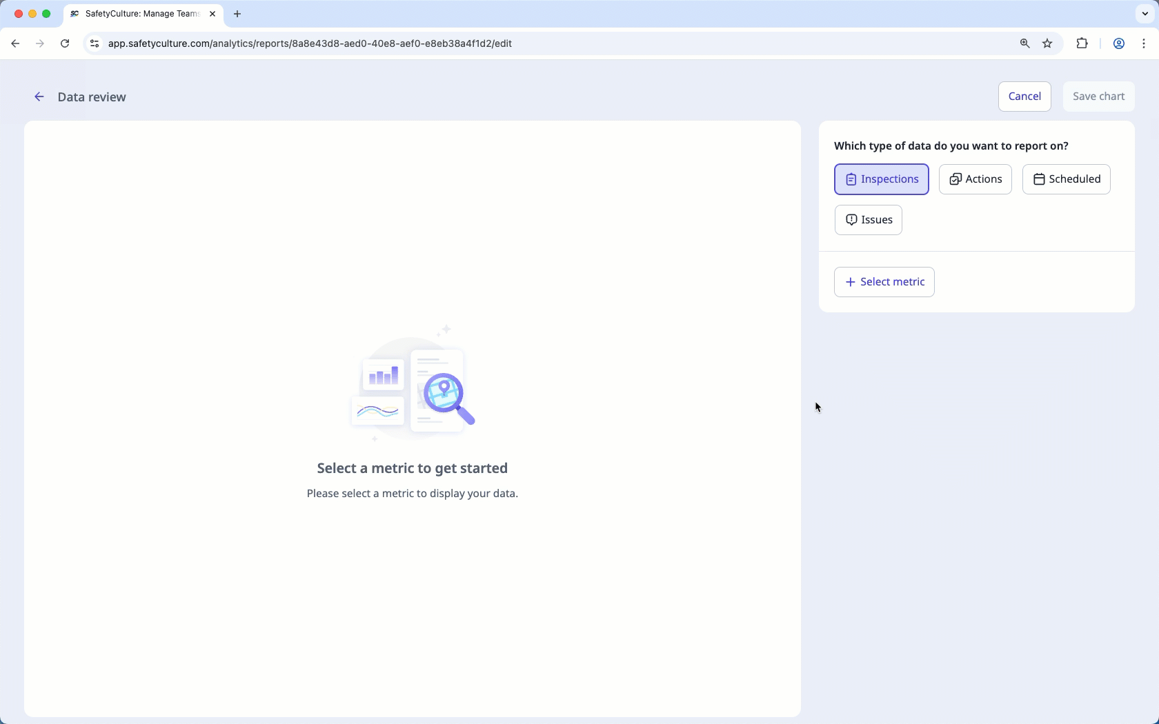
Datentyp: Wählen Sie oben rechts auf der Seite Inspektionen aus.
Messeinheit: Wählen Sie aus dem Drop-down-Menü Durchschnittliche Bewertung aus.
Klicken Sie oben rechts auf der Seite auf Diagramm speichern, um die Änderungen im Diagramm zu speichern.
Klicken Sie oben rechts auf der Seite auf Speichern, um die Änderungen in Ihrem Dashboard zu speichern.
Sie können Inspektionsbewertungen über Seiten, Abschnitte und Fragen hinweg verfolgen, indem Sie den Diagrammtyp „Zeitleiste“ verwenden.