We're constantly working to expand and enhance chart customization options for you. If you have any feedback or suggestions, we'd love to hear them from you!
What are Analytics charts?
Analytics charts are visual tools that help you understand your data at a glance, simplifying complex information and highlighting trends that are oftentimes hard to spot.
For example, you can compare inspection results and completion rate across sites during peak seasons. Using charts in your Analytics dashboards, you customize the data you see by changing chart types, configuring attributes, and modifying filters. This helps you monitor performance, identity patterns, and act on insights faster.
What you'll need
Customize a chart
Select Analytics in the sidebar or select it in More.
Click on the upper-right corner of the chart.
In the chart builder, configure the chart accordingly.
Configure the metric and attributes relevant to the data you need.
Add filters to narrow down the data.
Select a chart type that's most relevant to your data.
Click Chart settings to add a chart title and configure the KPI if needed.
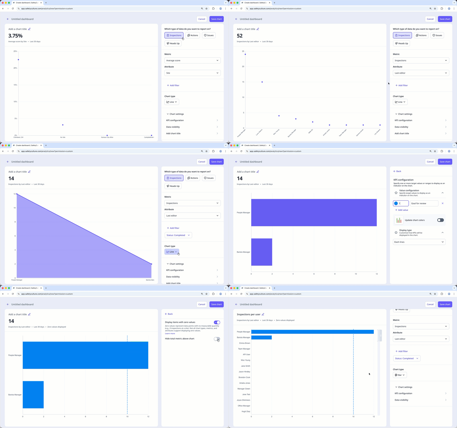
Click Save chart on the upper-right of the page to save the changes to the chart.
Click Save on the upper-right of the page to save the changes to your dashboard.
Check out more in-depth content in the Analytics section.
← Previous article: Gather meaningful data (Part 2) | Next article: Onboard new users →