Why use chart titles?
Chart titles are customizable labels for charts in Analytics dashboards that help describe what each chart represents. As your organization tracks more data and adds more charts, titles make it easier to organize complex dashboards and clearly differentiate between similar metrics, which is especially helpful when:
Reviewing complex dashboards with multiple data points.
Sharing dashboards with team members.
Collaborating with stakeholders who may not be familiar with the data setup.
Clear chart titles reduce the risk of misinterpreting data during reviews and ensure insights are understood at a glance. For example, you can use titles to distinguish between charts like “Inspections by Site” and “Inspections by Template", helping teams analyze trends with confidence and make informed decisions faster.
What you'll need
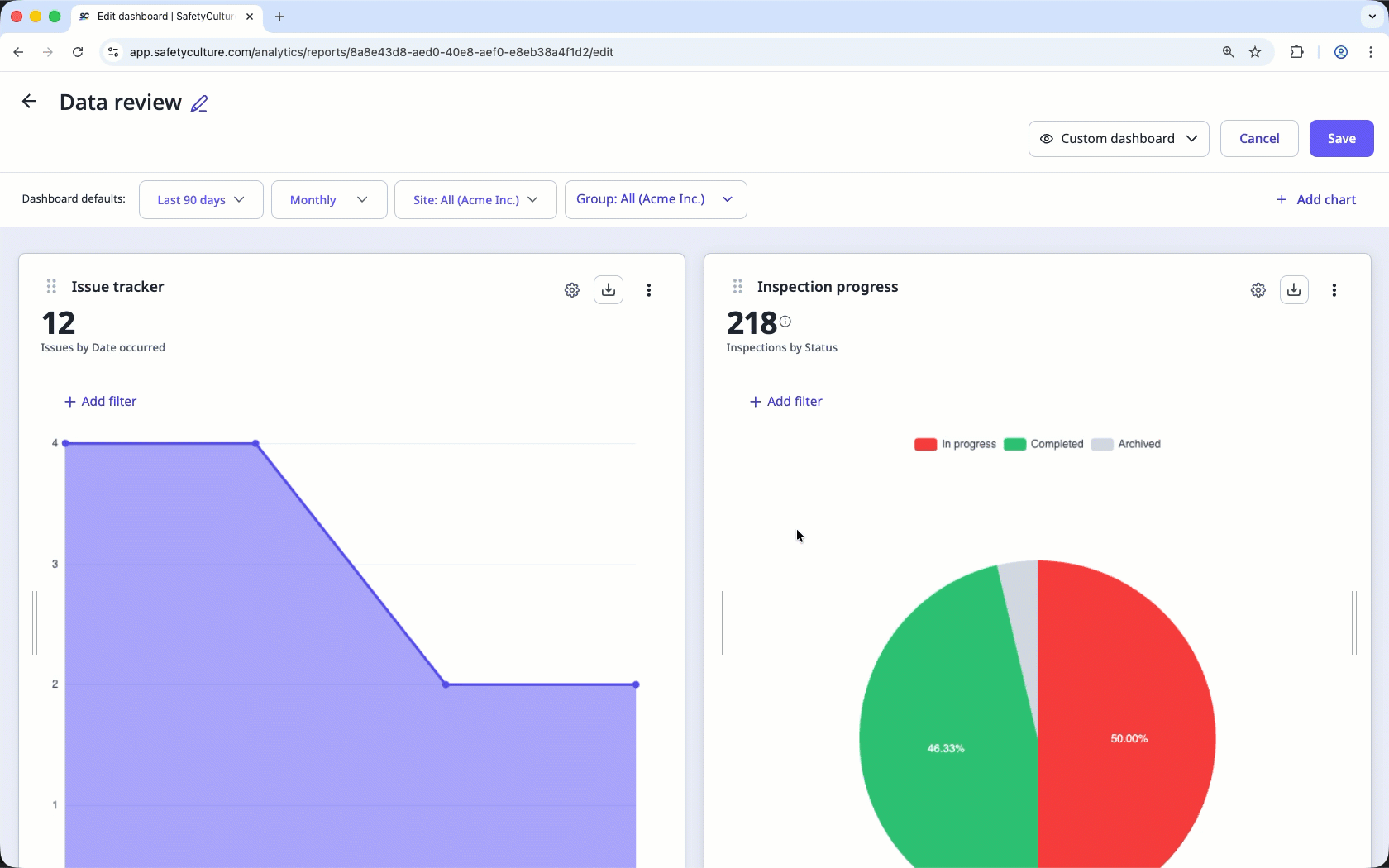
Add a chart title
Select Analytics in the sidebar or select it in More.
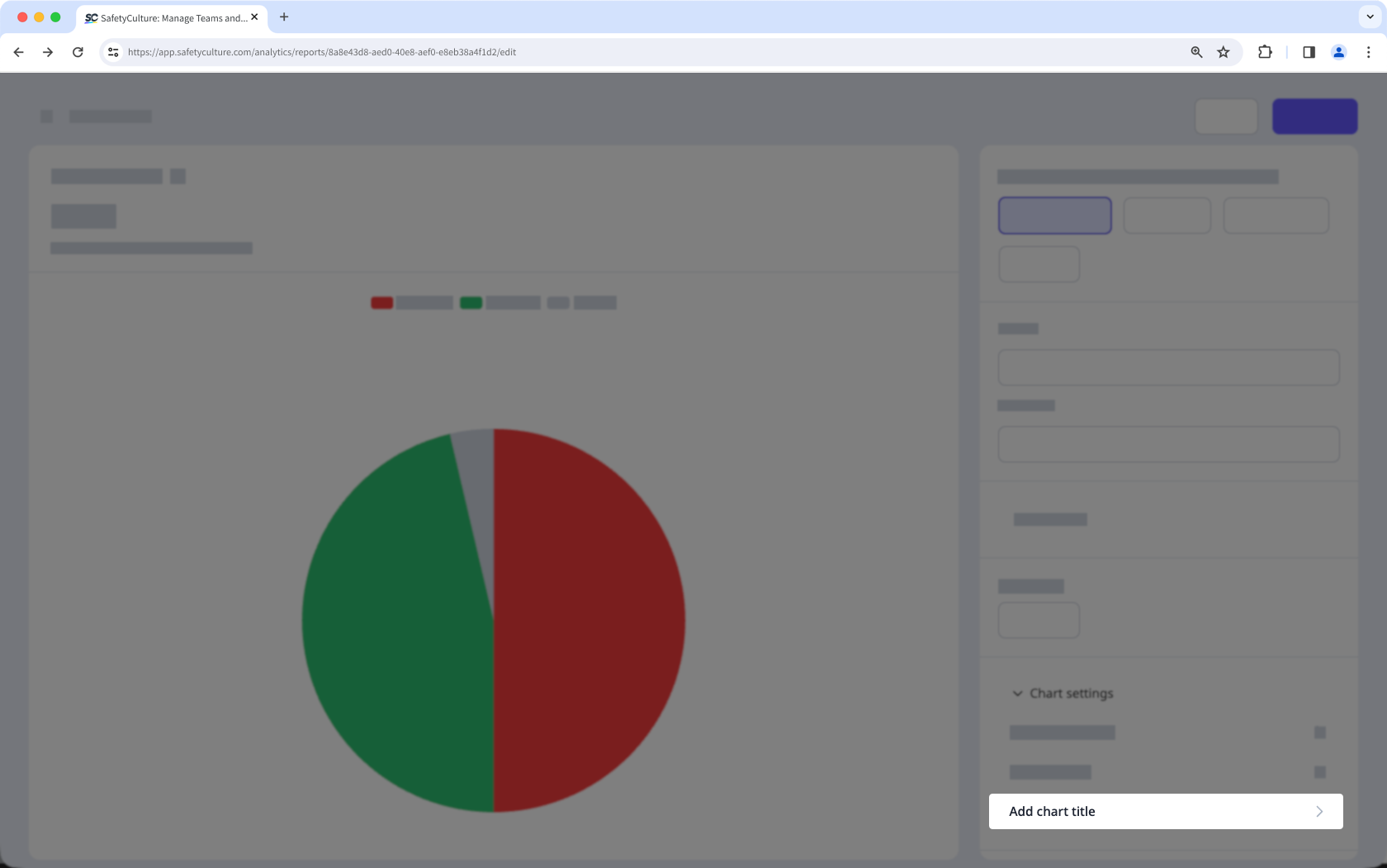
Click on the upper-right corner of the chart.
Click Chart settings, then select Add chart title.
Click Save chart on the upper-right of the page.
Click Save on the upper-right of the page.
Edit a chart title
Select Analytics in the sidebar or select it in More.
Click on the upper-right corner of the chart.
Click on the upper-left of the chart, then press enter or return on your keyboard or click anywhere in the chart builder.
Click Save chart on the upper-right of the page.
Click Save on the upper-right of the page.