The article outlines the functionalities of the new Analytics experience, which we're continuously improving. If you have any feedback about the new Analytics experience, we'd love to hear them from you.
What is Analytics in SafetyCulture?
Analytics in SafetyCulture allows you to visualize and understand the data your team captures. It’s best used when you need clear visibility into KPIs, performance trends, or specific areas that need attention. Analytics works through customizable dashboards, where you can choose from different chart types, tailor how your data is displayed, and control access using dedicated permissions.
For example, you can track inspection scores across sites, monitor action completion rates, or review data created across a period of time. You can also share dashboards within your team or export data for reporting, helping teams surface insights, highlight improvement opportunities, and make data-driven decisions.
By now, your pilot users have ideally tested SafetyCulture for two weeks and have enough activity in the organization that you can start visualizing your data in Analytics. We recommend you start with your initial data to determine what information would be helpful for your organization in the long run.
Explore analytics for Training in SafetyCulture using the performance dashboard to view your users' overall performance across published lessons and courses. You can also dive deeper into individual and group course completion progress.
Visualize your data
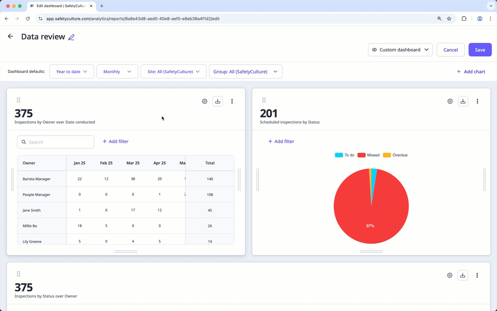
Focus on what's important by creating dashboards and charts that you can tailor depending on the data sets you want to analyze.
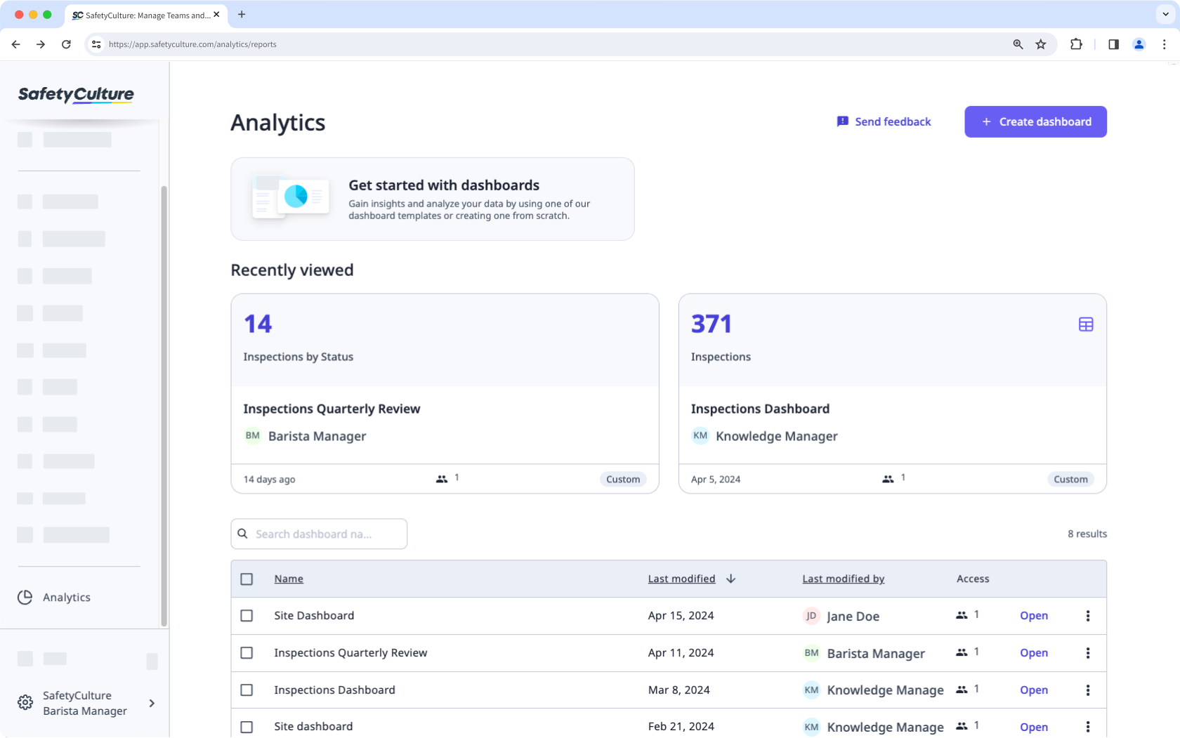
Dashboards
Once a dashboard is created and shared, it becomes available on the Analytics page. Each dashboard can contain multiple charts, which can be used to focus on a particular area of interest.
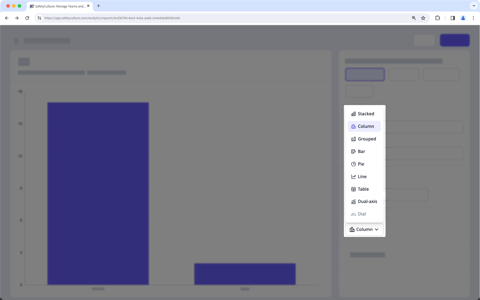
Charts
Analytics charts can be configured to ensure only relevant data is shared with your audience. There are multiple data visualization options available to allow you to convey your organization's data in the most suitable way.
Measure your data
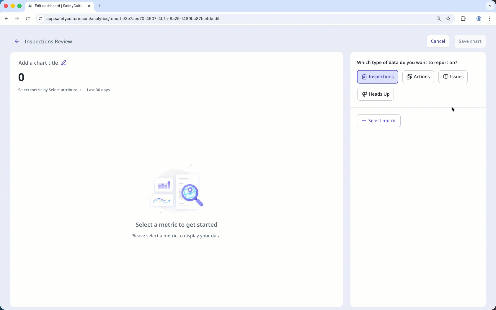
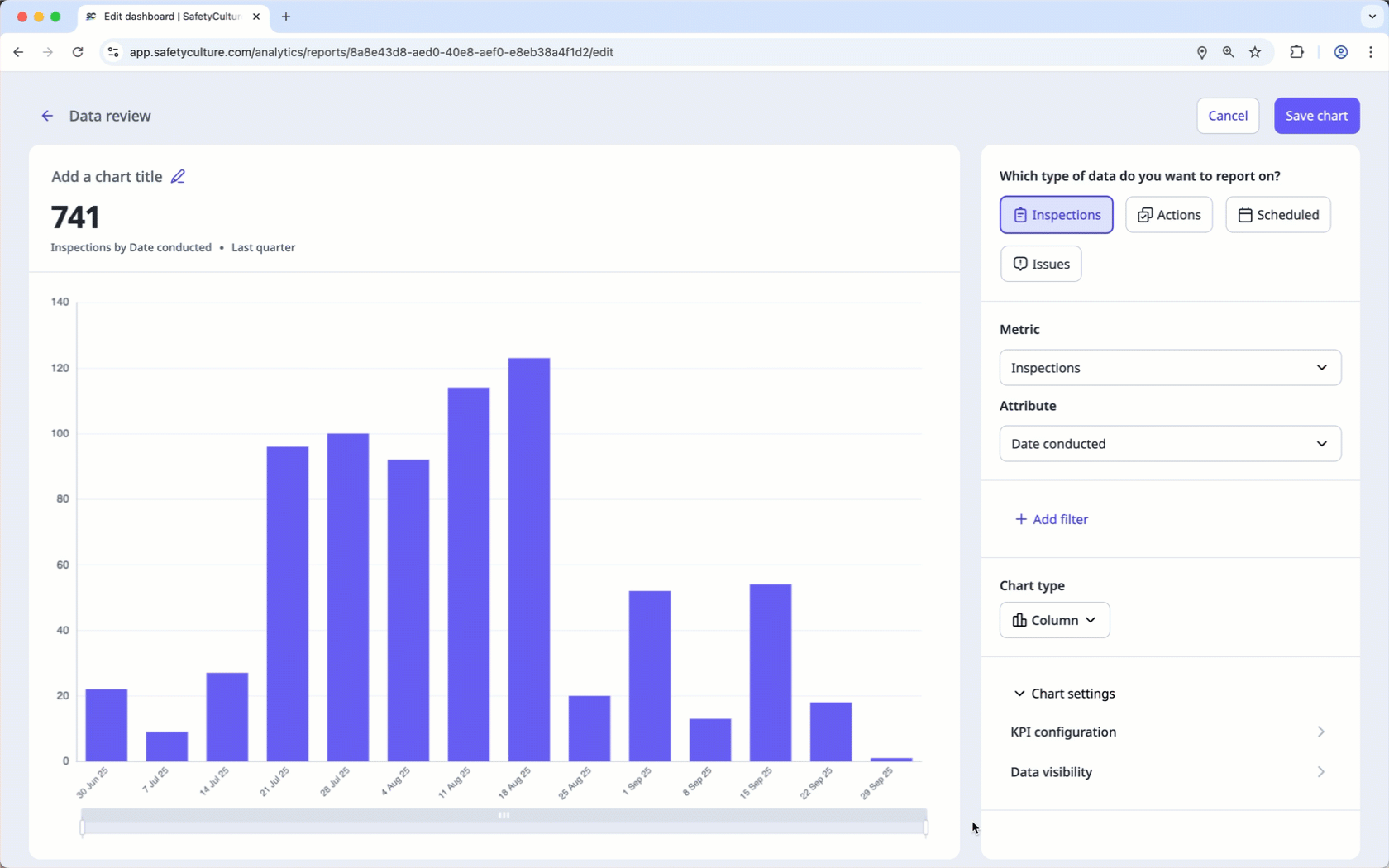
Configure your charts using metrics and attributes to focus on the data that matters most. When used together in Analytics, they give you a clearer picture of how work is being done, making it easier to spot trends, compare performance, and uncover insights that guide improvements across your team.
Metric: The measurement or calculation of data that's selected for a chart, such as inspection durations or the number of actions.
Attribute: An element by which you can break down your metric to gain further insights. For example, inspection date or site can be selected to group your metrics.
To further track your team’s performance, you can set up KPIs in charts to visualize progress against key targets and identify areas for improvement. You can set single or multiple values to measure results at different levels and gain clearer insights into your team’s performance.
Filter your data
A filter allows you to dive deeper into specific topics by limiting which data sets are shown. For example, the date filter can be used to focus on data from a specific date range.
← Previous article: Optimize your processes (Part 3) | Next article: Gather meaningful data (Part 2) →