Was ist die neue Analyse-Erfahrung?
Die neue Analysen-Erfahrung bietet mehr Flexibilität bei der Erstellung von Dashboards, die gezielt auf relevante Bereiche fokussiert sind und Daten anschaulich visualisieren.
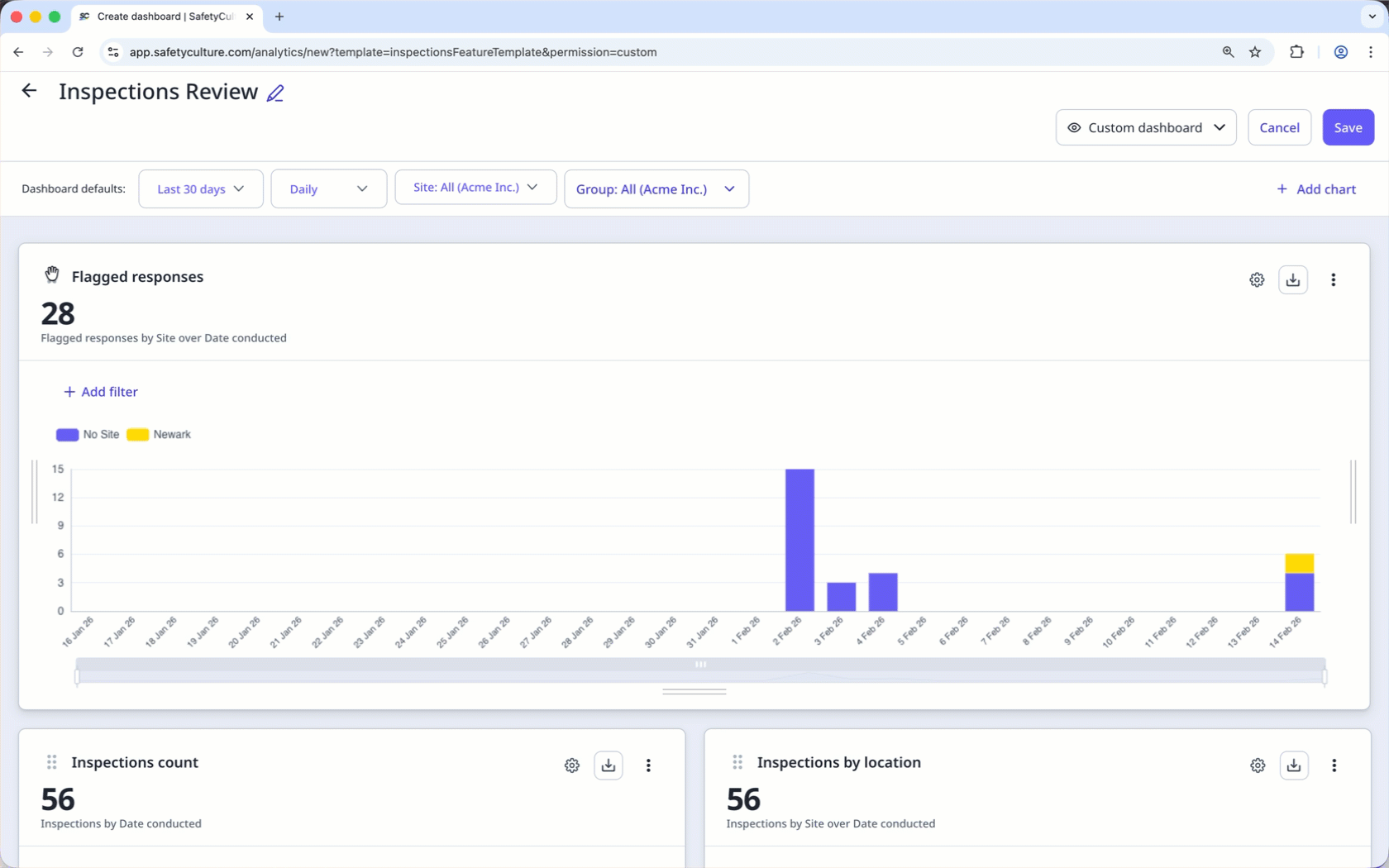
Dank der flexibleren Gestaltung können Sie jetzt Dashboards für bestimmte Datensätze erstellen, die für Sie relevant sind, und diese mit verschiedenen Diagrammtypen erstellen, um die angezeigten Daten besser zu verstehen und mit den umfangreichen Anpassungsoptionen Trends leicht zu erkennen. Darüber hinaus können Sie die relevanten Dashboards bequem mit Ihren Nutzern teilen. Je nach Dashboard-Typ und den richtigen Berechtigungen können sie diese nach Bedarf anzeigen oder verwalten.
Was Sie brauchen
Wenn Ihr Unternehmen noch Zugriff auf Legacy Analysen hat, können Sie ein Dashboard mit der Dashboard-Vorlage "Von Legacy zu Neu" erstellen.
Legacy-Diagramme und Dashboards in den neuen Analysen erstellen.
Wir empfehlen, Ihre Diagramme und Dashboards anzupassen, um das Beste aus Ihren Daten herauszuholen.