Change chart types
Learn how to change chart types in your dashboards using the web app, and explore the different chart types available.What chart types are available?
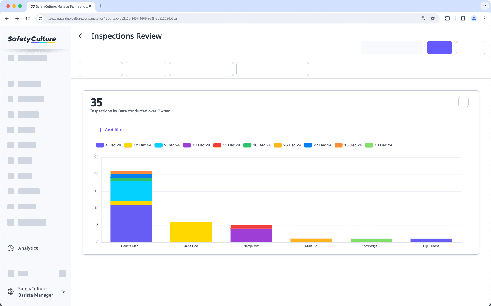
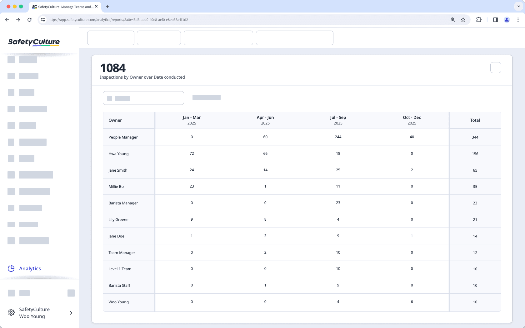
This chart type allows you to compare data by two different attributes. For example, you can view the number of inspections by the date conducted and the owner.
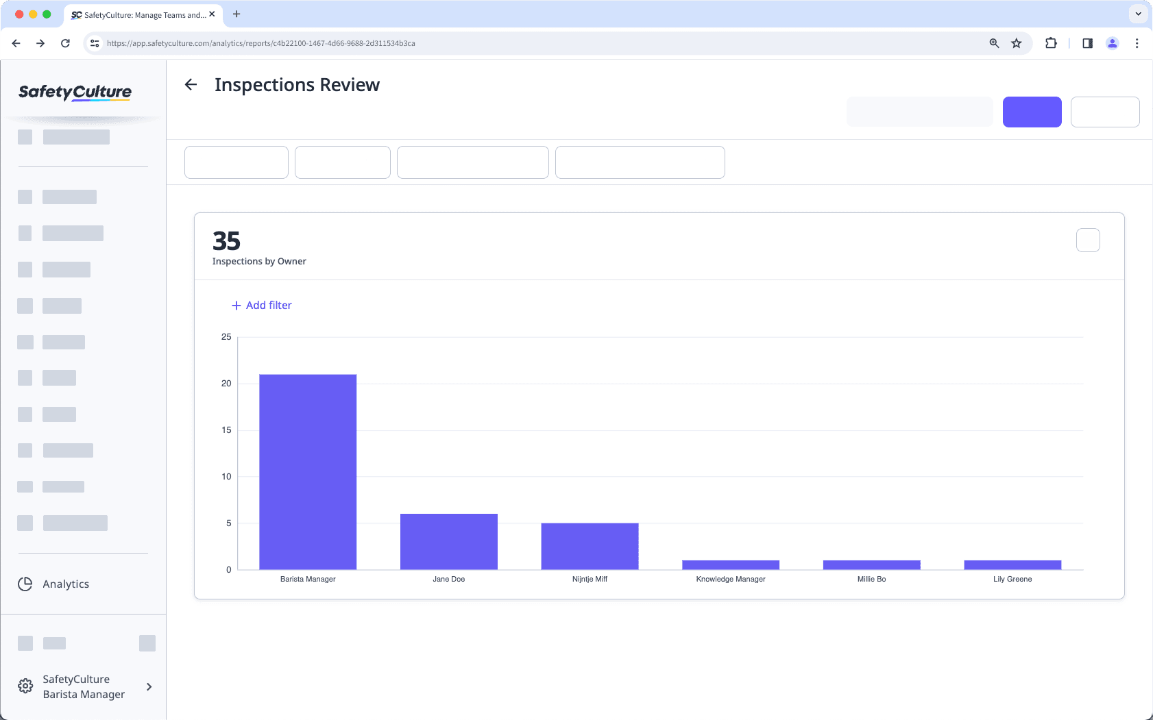
This chart type allows you to view your data vertically, with a metric by an attribute. For example, you can view the number of inspections by owner.
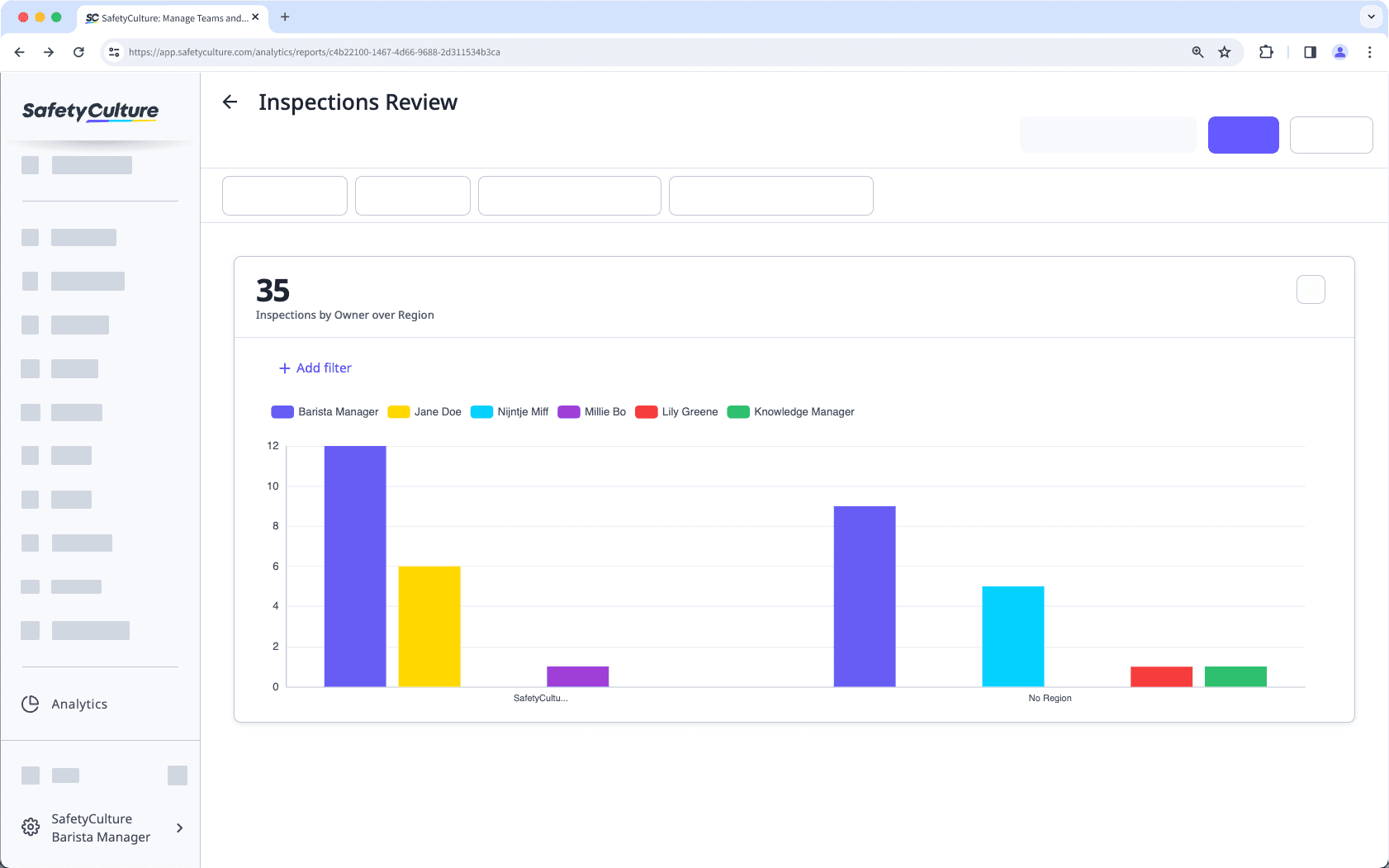
This chart type allows you to compare your data by two different attributes. For example, you can view the number of inspections by region over owner.
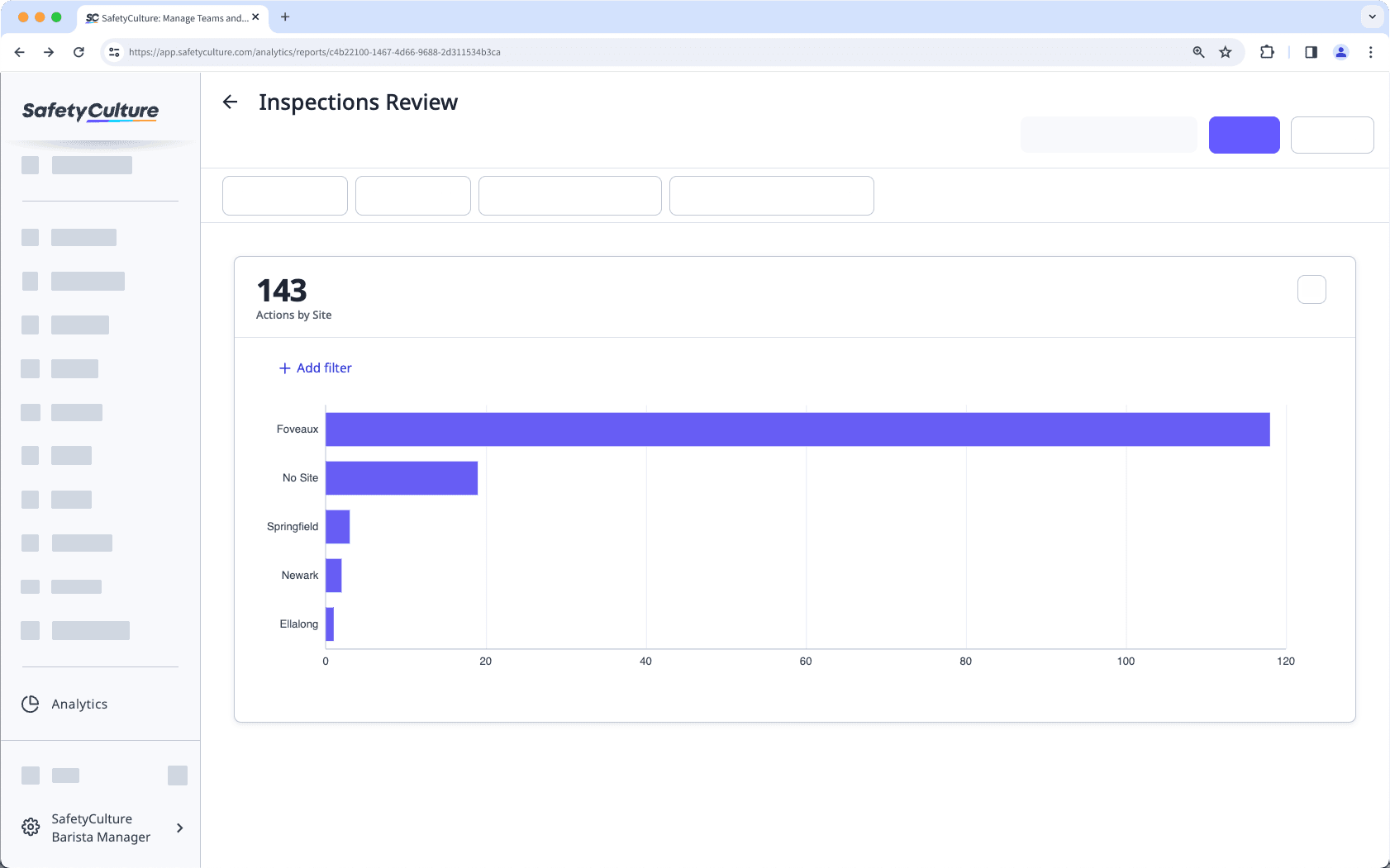
This chart type allows you to view your data horizontally, with a metric by an attribute. For example, you can view the number of actions by site.
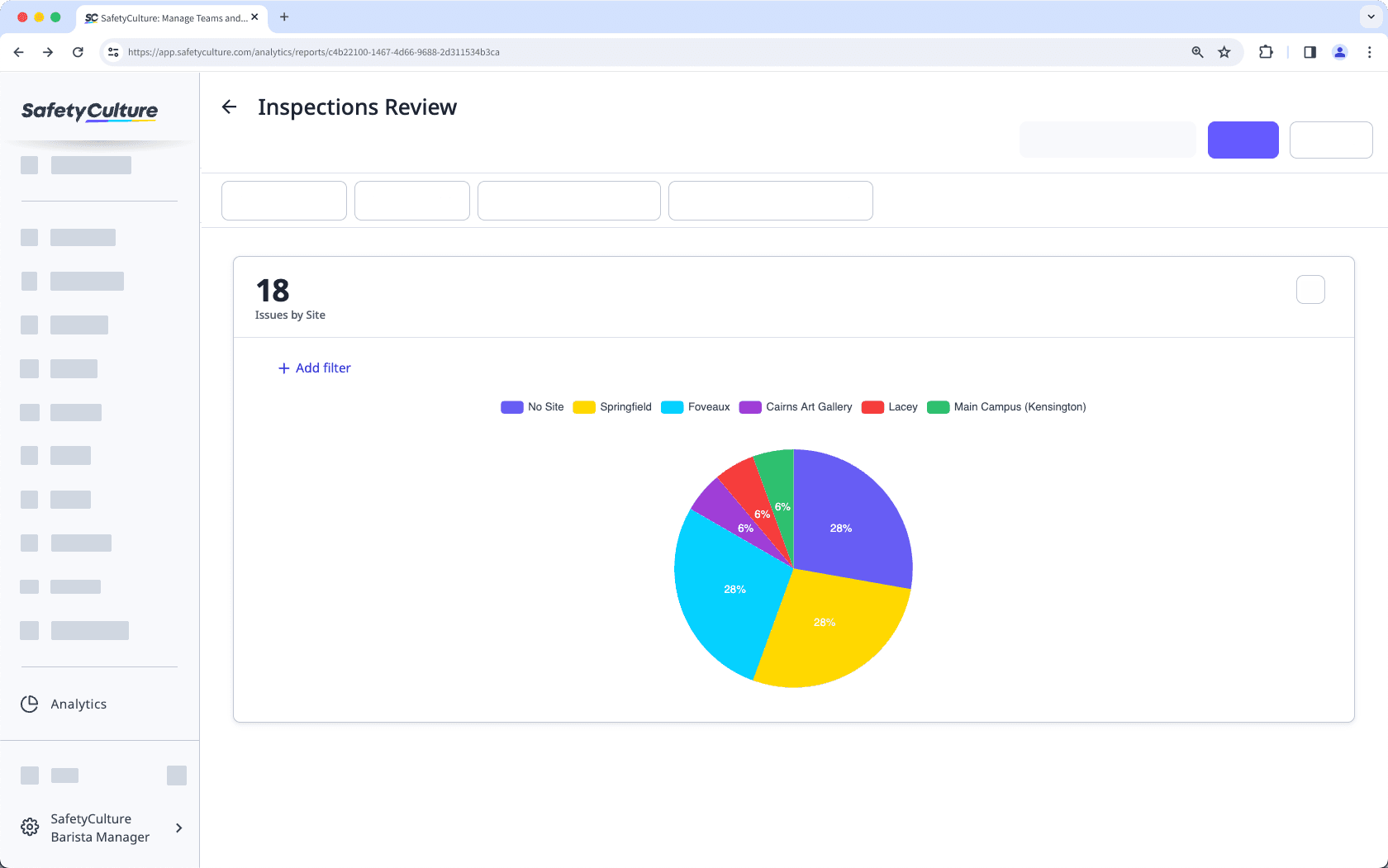
This chart type allows you to illustrate the sections of your data through a percentage per section represented, depending on the attribute you've selected. For example, you can view the proportions of the issues created by site.
Viewing negative inspection scores isn't supported in "Pie" chart types.
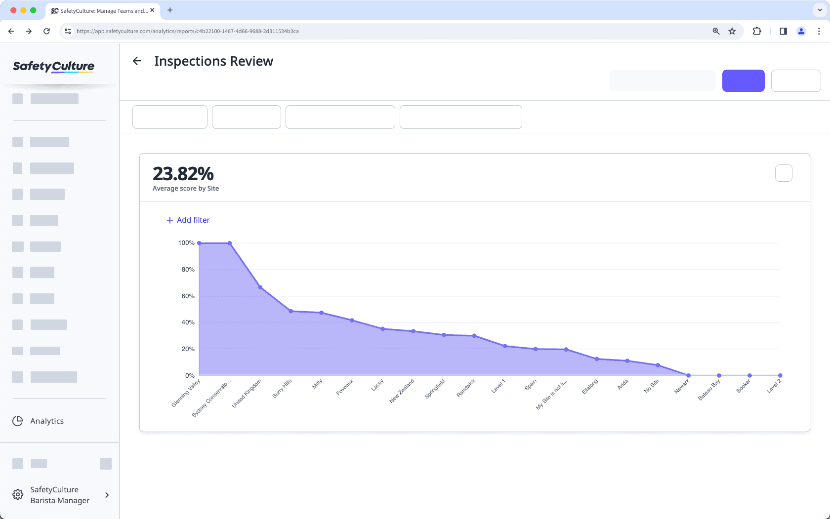
This chart type allows you to view the changes in value along a horizontal axis. For example, you can view your team's performance through the average score for inspections by site.
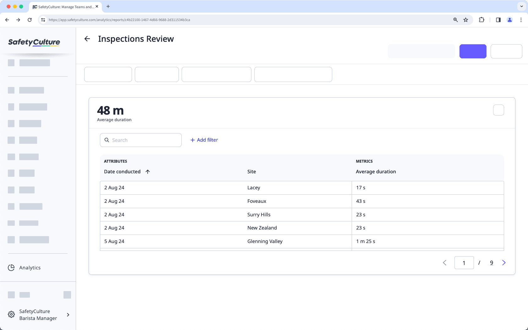
This chart type allows you to arrange your data in rows and columns by selecting two attributes. For example, you can view the average duration for inspections based on their conducted date and site in a tabular format.
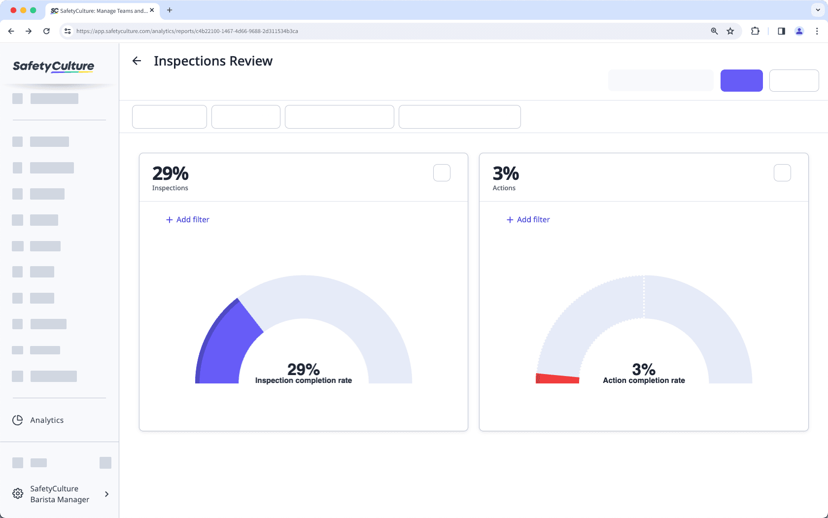
This chart type allows you to view your team's performance. You can configure a chart KPI to determine whether or not your team is meeting the set goals. Only percentage-based metrics (%) are supported for this chart type.
Viewing negative inspection scores isn't supported in "Dial" chart types.
This chart type provides an overview of data trends over a selected time period. You can choose a metric by two attributes: one date-based and one non-date-based. Scheduled inspections are currently unsupported.
This chart type allows you to view a breakdown of inspection responses, based on their question, sections, and pages.
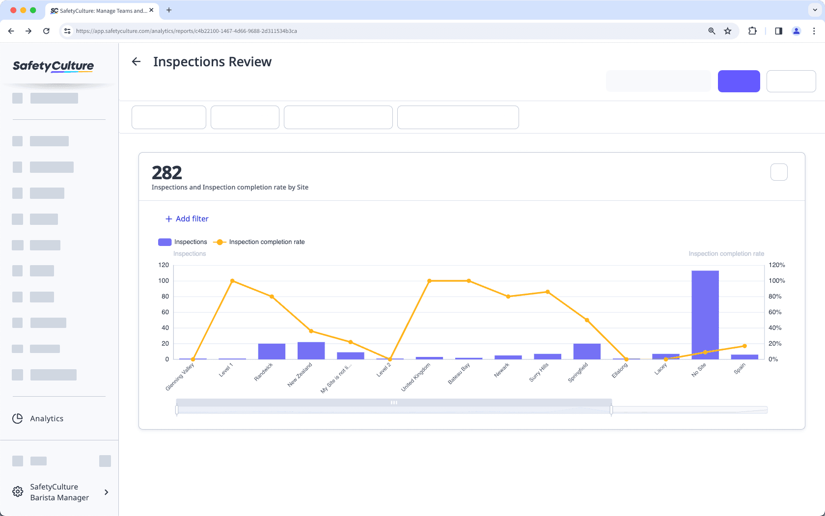
This chart type allows you to compare two different metrics by an attribute, allowing you to identify any correlations or trends between the selected metrics. Each metric selected is represented by a column and line chart, respectively.
You can only select metrics under the same data type per chart. For example, if you've selected "Inspections (Count)" as the first metric, the second metric must be selected from the Inspections data type, such as "Inspection completion rate".
Change a chart's type
Select
Analytics in the sidebar or select it in
More.
Click
on the upper-right corner of the chart.
Click the dropdown under "Chart type" and select the relevant chart type for your data.
Click Save chart on the upper-right of the page to save the changes to the chart.
Click Save on the upper-right of the page to save the changes to your dashboard.
Was this page helpful?
Thank you for letting us know.