Why configure KPIs in charts?
Configuring KPIs in your charts helps you track progress toward specific goals and understand how your team is performing in real time. By adding one or more KPIs to your dashboards, you can monitor key metrics, spot trends, compare results, and take action when things go off track.
By setting clear KPIs, you turn your dashboards into live performance tools that help your team make informed decisions and stay aligned on what success looks like.
What you'll need
You can have up to 5 KPI values per chart.
Configure a chart KPI
Select Analytics in the sidebar or select it in More.
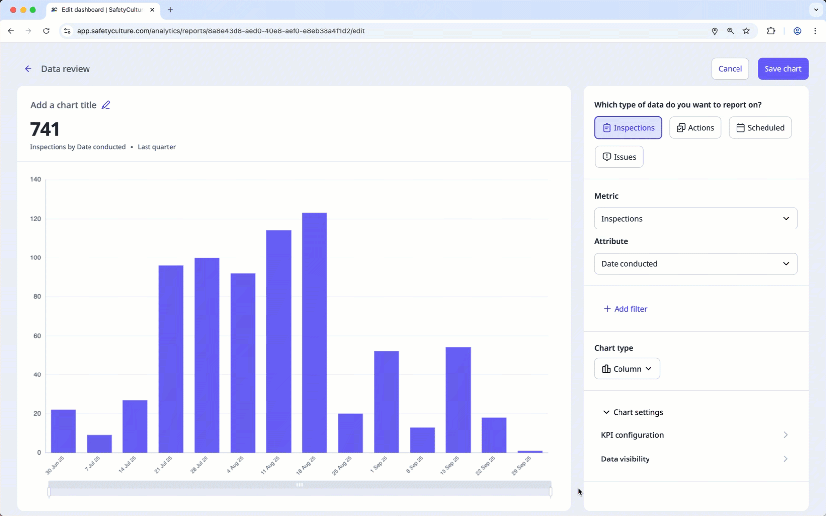
Click on the upper-right corner of the chart.
In the side panel, c lick Chart settings and select KPI configuration.
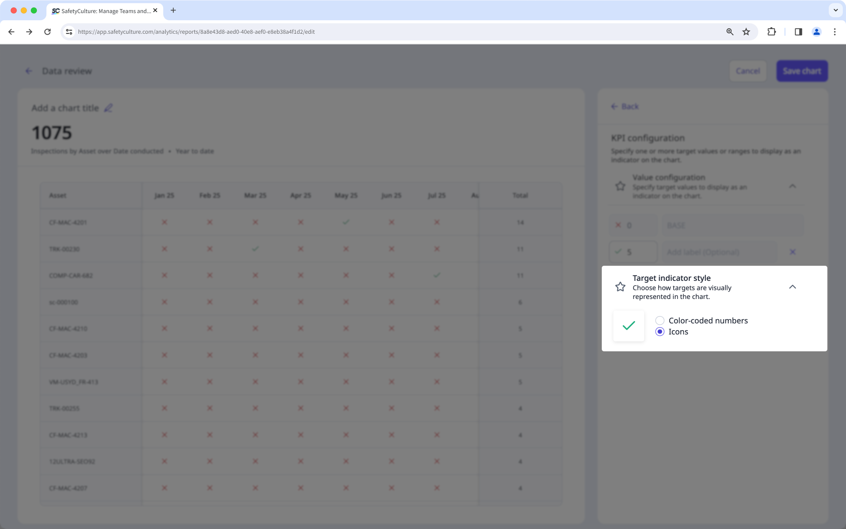
In the side panel, configure the KPIs accordingly.
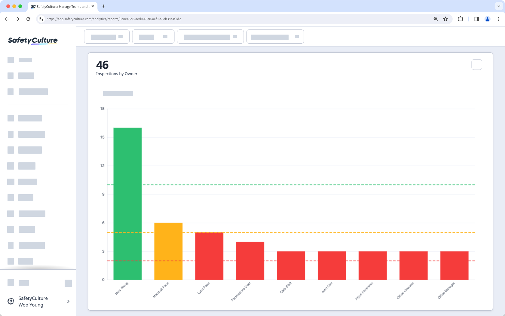
Value configuration: Enter a value and a label. To add more KPIs, click Add value. You can also change the chart colors by turning on “Update chart colors”.
Display type: Click the dropdown list and select how you want the values to be displayed on the chart.
Target indicator style: For "Timeline table" chart types, select between "Color-coded numbers" and "Icons" to display whether or not the target is reached.
Click Save chart on the upper-right of the page.
Click Save on the upper-right of the page to save the changes to your dashboard.
For a single KPI value, use "Line" or "Dashes" as the display type to make the target easier to read on the chart.
Limitations
Configuring KPIs isn't available for "Pie", "Table", "Responses table", and "Dual-axis" chart types.