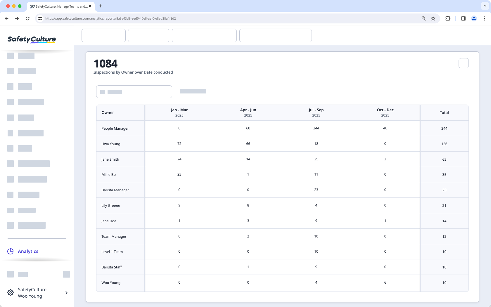
Why create a timeline table chart?
Creating timeline table charts in Analytics gives you a clear view of your organization’s progress and performance trends. They’re most useful when you want to compare results and identify recurring patterns, or see how your team’s work changes over time. For example, you can review weekly inspection activity, monitor quarterly issues, or explore other key metrics that matter to your goals. This helps connect everyday work to long-term objectives, making it easier to spot opportunities for improvement.
What you'll need
Create a timeline table chart
Select Analytics in the sidebar or select it in More.
Click Add chart on the upper-right of the page, and select Add custom chart.
In the chart builder, configure the chart by selecting a data type, metric, and attributes.
Under "Chart type", s elect
 Timeline table from the dropdown.
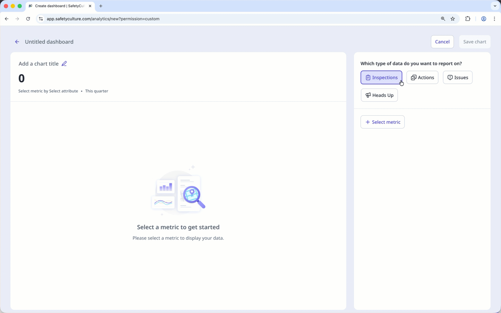
Click Save chart on the upper-right of the page to save the changes to the chart.
Click Save on the upper-right of the page to save the changes to your dashboard.
You can adjust the “Date” and “Frequency” dashboard filters and configure chart KPIs to make tracking goals easier at a glance.