Why use Custom CSS for course themes?
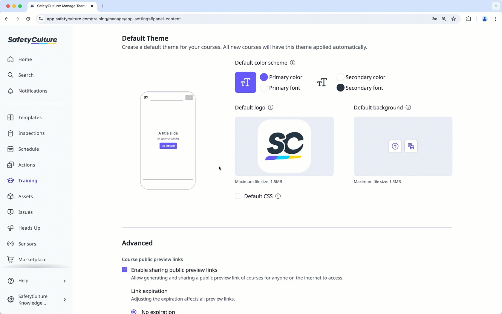
The Training feature in SafetyCulture platform offers a wide range of customization options for your training materials. You can manage course themes to select color schemes, add logos, and more to create visually impactful and engaging content. If you have coding knowledge and experience, you can customize your course themes beyond the available options we provide with custom CSS to create that "Wow" moment for your team members.
Applying custom CSS in the Training feature is outside the scope of our support, so we're unable to provide guidance or assist with setup and troubleshooting.
Since custom CSS is a code-based solution, we also cannot guarantee its functionality or full compatibility with the Training feature. This includes interaction with our responsive design and its performance across all courses.
Sample CSS code
To help you get started with custom CSS for course themes, we have code samples that you can use as references to format the following elements in a course:
Fonts and text
Buttons
Headers and borders
Content and interactions specific to different types of slides
We encourage you to test the theme of your courses using our sample CSS code and modify them to suit your organization's brand.
Fonts and text
/* FONTS - You can change this by finding a font to import on Google */
@import url('https://fonts.googleapis.com/css2?family=Noto+Sans&display=Poppins&display=swap');
h1 {
font-family: 'Poppins', sans-serif;
color: var(--text-color);
font-size: 28px;
font-weight: 600;
}
h2 {
font-family: 'Poppins', sans-serif;
color: var(--text-color);
font-size: 22px;
}
h3, h4, h5 {
font-family: 'Noto Sans', sans-serif;
color: var(--text-color);
font-size: 16px;
}
body {
font-family: 'Noto Sans', sans-serif;
color: var(--text-color);
font-size: 16px;
}
Root variables
:root {
--main-color: #6559FF;
--accent-color: #FFD700;
--text-color: #293745;
}
Buttons
/* BUTTONS */
.btn.btn {
background-color: var(--main-color);
color: #ffffff;
border-radius: 8px;
font-size: 15px;
}
.btn.btn:hover {
background-color: #564BE7;
color: #ffffff;
border-radius: 8px;
transition: 0.3s;
}
.btn.btn:active {
background-color: #564BE7;
color: #ffffff;
border-radius: 8px;
}
Bottom border
/* BOTTOM BORDER */
.block-h-lg {
border-bottom: 5px solid black;
border-image: linear-gradient(90deg, rgba(101,89,255,1) 33%, rgba(20,202,255,1) 33%, rgba(20,202,255,1) 65%, rgba(255,215,0,1) 65%, rgba(255,215,0,1) 100%);
border-image-slice: 30;
}
Lesson header
/* LESSON HEADER */
#indicator {
color: #6559FF;
background: #ffffff;
}
#lesson-header-nav {
background-color: var(--main-color);
color: #ffffff;
font-size: 13px;
}
#lesson-header-nav-menu-btn {
border-color: #ffffff;
color: #ffffff;
}
#lesson-header-title-content {
border-bottom: 0px solid transparent;
font-family: 'Noto Sans';
font-size: 15px;
}
#slides {
font-family: 'Noto Sans', sans-serif;
color: var(--text-color);
font-size: 16px;
border-bottom: 0px solid;
}
.slide-footer .slide-footer-prompt-content {
font-style: shadow;
}
Answer slide
/* ANSWER SLIDE */
#slide-answer {
color: var(--main-color);
}
Expandable list
/* EXPANDABLE LIST */
.slide-expandable-list .item.active .item-button {
background-color: #564BE7;
color: #ffffff;
}
.slide-expandable-list .btn.btn-solid {
border-radius: 3px;
}
True or false
/* TRUE OR FALSE */
.slide-game-true-or-false .game-statement {
background-color: var(--main-color);
color: #ffffff;
font-size: 14px;
}
Multiple choice
/* MULTIPLE CHOICE */
.selectable.active .btn {
background-color: var(--text-color);
color: #ffffff;
}
.slide-multiple-choice-game.state-complete .selectable.correct .btn {
background-color: var(--text-color);
color: #ffffff;
}
.slide-multiple-choice-game.state-complete .selectable.incorrect .btn {
background-color: #3030;
color: var(--text-color);
}
Multiple-choice chat
/* MULTIPLE CHOICE CHAT */
/* Question Bubble */
.quote.quote-dk {
background-color: #dbdff7;
color: var(--main-color);
}
.quote.quote-dk:after {
border-color: #dbdff7 transparent transparent;
}
/* Choice Bubbles */
.quote.quote-lt {
background-color: var(--main-color);
color: #ffffff;
}
.quote.quote-lt:after {
border-color: var(--main-color) transparent transparent;
}
/* Active Bubble */
.quote.active {
background-color: #14caff;
color: #ffffff;
}
.quote.active:after {
border-color: #14caff transparent transparent;
}
/* Correct Answer Bubble */
.slide-chat.state-complete .chat-msg.correct {
background-color: #14caff;
color: #ffffff;
}
.slide-chat.state-complete .chat-msg.correct:after {
border-color: #14caff transparent transparent;
}
Reveal
/* REVEAL */
.slide-reveal .btn-reveal-title.flippable {
background: #14caff;
color: var(--text-color);
}
.slide-reveal .btn-reveal.active .btn-reveal-desc.flippable {
background: #e8faff;
color: #14caff;
}
.slide-reveal .btn-reveal-desc, .slide-reveal .btn-reveal-title {
pointer-events: none;
}
Speech bubble
/* SPEECH BUBBLE */
/* dark */
.slide-speech-bubble .quote.pull-left.quote-dk:after {
border-color: transparent transparent transparent;
}
/* light */
.slide-speech-bubble .quote.pull-left.quote-lt {
background: #f9f9f9;
border-left: 8px solid #14caff;
margin: 1.5em 10px;
padding: -5em 1px;
quotes: "\201C""\201D""\2018""\2019";
}
.slide-speech-bubble .quote.pull-left.quote-lt:before {
color: #ffd700;
content: open-quote;
font-size: 130px;
line-height: 0.1em;
margin-right: 0.25em;
vertical-align: -0.4em;
}
.slide-speech-bubble .quote.pull-left.quote-lt:after {
border-color: transparent transparent transparent;
color: #ffd700;
content: close-quote;
font-size: 130px;
line-height: 0.3em;
margin-left: 1.4em;
vertical-align: -0.4em;
}
Image slider
/* IMAGE SLIDER */
.slide-image-slider .style-default .caption-content {
background-color: #dbdff7;
color: var(--main-color);
}
Slider buttons
/* SLIDER BUTTONS */
.slide-image-slider .btn-down {
border-radius: 50%;
color: #ffd700;
}
.slide-image-slider .btn-up {
border-radius: 50%;
color: white;
}
.slide-image-slider .btn-down:hover {
border-radius: 50%;
color: white;
}
.slide-image-slider .btn-down:active {
border-radius: 50%;
color: #14caff;
}
.slide-image-slider .btn-up:hover {
border-radius: 50%;
color: #14caff;
}
.slide-image-slider .btn-up:active {
border-radius: 50%;
color: #14caff;
}
.slide-text-sequence .btn-down {
border-radius: 50%;
color: #ffd700;
}
.slide-text-sequence .btn-up {
border-radius: 50%;
color: #ffd700;
}
.slide-text-sequence .btn-down:hover {
border-radius: 50%;
color: #14caff;
}
.slide-text-sequence .btn-down:active {
border-radius: 50%;
color: #14caff;
}
.slide-text-sequence .btn-up:hover {
border-radius: 50%;
color: #14caff;
}
.slide-text-sequence .btn-up:active {
border-radius: 50%;
color: #14caff;
}
Scrolling
/* SCROLLING MIX */
.pswp__top-bar {
color: #293745;
}
.pswp--notouch .pswp__hint:before {
content: "Press ESC to dismiss";
color: black;
}
State prompt
.state-prompt .slide-footer .slide-footer-prompt, .state-intro .slide-footer .slide-footer-prompt {
font-family: 'Noto Sans';
font-size: 14px;
border-bottom: 0px solid transparent;
}
Public CSS resources
If you need any further guidance, here are some helpful online resources that can help you get started with CSS code: